Quilt Labels vs Art Labels

Someone asked if I could explain the shortcomings of labels, as described by Del Thomas. I actually agree with her, although I also agree with the art-minded people who only want to sign their work and hope someone recognizes that name in the future. So there’s two parts of the label in quilting: the name/signature and the contact info/additional info about the quilt, like who it was made for and why (wedding, birth, etc.). It’s hard to ignore the history of quilts being given as gifts for significant events, and surely the labels should give the history of the quilt in those situations. They have much more meaning if we know it was made in 2013 for the first grandchild.

So why would we need a label for an art quilt? Some would argue we don’t, that if Picasso paints a painting, he signs it, and everyone knows who it is.

PicassoSignature

That said, at the time, did his signature mean that you knew how to find him? I mean, I would recognize, say, Hockney’s signature, and I could use The Google to locate him in general, and maybe even find a gallery (or 700) that represented him, but if I wanted a commission from him or to purchase a particular piece, then I would be out of luck, unless I emailed all 700 galleries until the one that actually had access to him (or his agent) answered back.

So the label must have some purpose besides the signature. I do actually agree that we should be signing our art quilts on the front. Do I do this? No. I always forget. I would have to do it in pen, too, since I really don’t like the signed-in-stitches version unless it’s not totally obvious and detracting from the image, which is difficult, because of the texture added by the stitching. It’s difficult in the regular arts as well, though, so you just have to find a way to make it work. Maybe the key is to stitch it on the top, before it’s quilted, and then quilt over it? I may have to experiment with this. Some people have a stamp with a chop or a signature that they use. I think you might as well sign for real in that case.

The label, though…if I buy a piece of art, say a painting or a print or a photo, I want to be able to contact the artist again in case I want to buy more, right? So the artist needs to provide that information. In this day and age, it would be nice to say that all artists are online and easy to find, but all you need to do is look at my post on Quilt Visions: Brainstorms (or any other art review) to know that many artists aren’t easy to find at all. If you buy a piece of non-fiber art, usually the artist attaches their business card to the back. So you have a signature on the front and contact info on the back…if you want to have someone ever find you again. Presumably, some significantly reclusive artists want no one to find them ever. I’m not that artist.

I don’t print my own labels; I know people who do, but I’m not that organized. I just hand-write the info.

Feb 19 13 001 small

Sorry. I did block out my home address and phone numbers. Obviously I don’t care about my label being all straight lines either.

One thing I learned late in life to plan for is the odd show that requires a bottom slat…because if you don’t put the label high enough, you will have to do what I did…

Feb 19 13 003 small

I’m trying to train myself to put bottom sleeves on my bigger (wider) quilts…they do hang better. But even if I don’t, I try to remember to put the label up higher, so in case I have to add a sleeve, I won’t be making it look this lame again. I just realized I also put the date of the quilt. I’m not sure why I put the month…it’s more for me than for anyone else. I like knowing what happened when. In my personal notes, I even put the DAY I finished it. Yes. I have issues.

While I was looking for pictures for this post (I like pictures), I found this great example of a “label” on the back of the info, but also a printed card attached to the back with CARE instructions.

back of art

I would argue that the contact info is not complete, obviously, but it does list materials and specific care instructions. In fact, Fountain Street Fine Art (which is where that picture came from) wrote a great post on shipping work related to encaustics, which aren’t quilts, but do require special care. Why aren’t we supplying care instructions on the back? Fabric does have specific instructions…I know many who provide those separately, but if you’re like me, you file that stuff Never To Be Found Again. Maybe it belongs on the back (OK, a small piece just got very crowded).

So back to quilt ART labels. I say sign your quilt. On the front. Like an artist, because you are one. I’m going to make an effort to try that this year (with the next quilt). THEN put your contact info on the back and any necessary care instructions for the piece.

What do people need in order to find you? Name, website, email, phone number. I always put my home address as well, in case my quilt gets separated from its box. I’ve heard too many horror stories from users of UPS, FedEx, and the post office. I actually fuse AND hand stitch labels on the back…heard other horror stories about labels being removed and people pretending someone else’s quilt is theirs. I put both home (yes, I still have a land line…have to where I live) and cell numbers. I also sign the back, but I don’t know that it’s necessary if you sign the front? Although if you stitch your signature, someone could remove that…but I guess if you sign with pen, they could applique over it. There’s only so much paranoia your art can handle…

So. Be an artist and sign your work. Then make sure your fans can find you. If you don’t have a website, that’s a whole ‘nother issue. If you want to sell stuff, you need to have something, whether a blog or Etsy or even Flickr (but don’t expect to sell much). I hope that helps…readers, as always, your wish is my command (um. OK. That’s not true. This topic was just easy to write about and I have a fairly strong, although evolving, opinion).

Quilt Visions:Brainstorms…Finally

I know. I’ve taken a long time to post this. I like putting links to artists, so that takes time, but the closing exhibition is next Saturday (February 9) and the exhibit itself closes February 17, so I’d better do it soon or it makes no sense at all.

I loved the Oceanside Museum of Art space for showing Quilt Visions…it’s huge and has high ceilings and big open spaces (although it seems pretty crowded on opening night no matter what). I was concerned the Visions Art Museum space would be too small, too crowded. I think they helped a bit by reducing the size of pieces, but then again, you miss out on the giant VALYA felted face, the Velda Newman flowers, or Wendeanne Ke’aka Stitt’s Day of the Dead piece when you limit the size. So that’s a loss…that said, the show had interesting work, as always. The catalog is good for statements and all that. I have them going back 10 or 12 years, I think.

So they let the artists wander around and take pictures. I wasn’t very scientific about it, because I figured I had the catalog for good pictures of the pieces…I just wanted a general idea of the layout and the space.

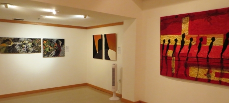
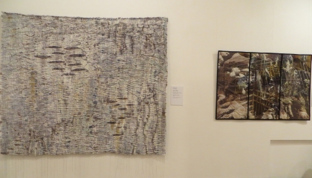
This picture is the entrance to the back gallery (which is now the VALYA gallery). You can see from the left the tip of Dinah Sargeant’s piece, Velda Newman’s White Pelicans, which is beautiful in color and stitching, and Marilyn Henrion’s Soft City: Broadway Windows, which is digitally manipulated photography. I’m not usually a fan of that, but I like what’s she’s done here. In the back room, there is an image of most of Tiziana Tateo’s Unstable Balance and Barbara Lange’s Monochrom V-Quest, which has fluorescent thread that glows in the dark…interesting when you realize insects can see light waves that humans can’t.

This is inside the back gallery, with my piece Sediment on the left, then Patricia A. Washburn’s piece Neon Reflections on a NYC Skyscraper, Wen Redmond’s First Light, and on the other wall, Lori Lupe Pelish’s Hey! OK OK piece, which is very cool and much more beautiful in person than in pictures.

Here’s a closeup of Pelish’s piece(s), which still doesn’t do them justice. She performs miracles with fabric patterns.

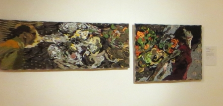
This is another view of that back gallery, with Pelish’s piece on the left, then Leesa Zarinelli Gawlik’s Wandering Through next to Tateo’s piece. Interesting that the two Italians were side by side. Notice also all the standing fans…this space is not air-conditioned, and with lots of people, it’s HOT.

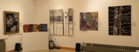
This is the other corner, with Tateo and Lange’s pieces, and Valarie Robinson’s Homage to Federation, using the shape of pioneer dresses, then drawing and writing on the shapes with the sewing machine. It would have been nice with a colored wall behind it.

The last corner with Robinson’s dresses, my piece, and Washburn and Redmond’s pieces.

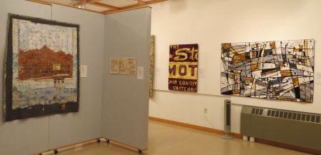
This is the small space right next to the back gallery (I really did photograph back to front). On the left is Joan C. Sowada’s All the World’s a Stage, a small piece, and Kathy Weaver’s Mimetic Concerns. I loved her robots and I still love her scientific pieces. They have a great movement and color in them. To the right is a great graffiti piece by Judith Plotner, Urban Vibrations. I used to take pictures of urban graffiti, and this piece reminds me of what attracted me to those places.

To the right of the Plotner piece is Carol Coohey‘s My Breath Coming out of Your Chest and Kerby C. Smith‘s Stone Stretch: Reflection, which was intriguing. To the right is one of my favorite artists, Dinah Sargeant, with her piece Leaping into Watersky. I got to meet Dinah finally and that was very cool…I love all her work.

Facing this gallery is Susan Cavanaugh‘s Ori-Kume #30, which has great threads running through and floating off the piece. To the right is Robert S. Leathers‘ Kings Canyon.

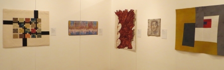
Looking further along that wall, you can see the right side of the Leathers’ piece; Nancy L. Cordry‘s Interjections; Lisa Kijak‘s complex The Stars Motel, Chicago; Katie A. Pasquini Masopust’s Pizzicato; and more (better pictures to follow).

This is the second gallery back from the entrance, with Nancy M. Condon‘s Kaleidoscope on the left wall, then Deborah M. Franzini‘s Vortex, and Ree Nancarrow‘s Black Spruce One (much better in closeup, check out the catalog).

Another view of Franzini and Nancarrow’s pieces, then Sandra Poteet‘s In the Wind, VALYA‘s Engrams.59, which was unfortunately cut off in the catalog; and Gail J. Baar‘s Lost & Found: Blocked.

On the wall closest to me is Kathleen Kastles‘ Name That Tune, a hand-painted piece. On the furthest wall is Linda Colsh‘s Twilight. I’ve always loved her work and it was a joy to meet her in person as well, for the first time. To the right of Colsh is Charlotte Ziebarth‘s Deep Pool, Bright Water, and Denise Oyama Miller‘s great tree piece, Sentinels.

This is a closer picture of Ziebarth and Oyama Miller’s pieces, plus Betty Busby‘s Growth Factor, stunning in person and in the book with details of the cell parts. It was nice to meet Betty as well…it’s fun to hear people’s voices and see them interacting, so the picture you have of them with their work makes more sense.

This is near the entrance, with Mary T. Buchanan‘s Isolation Gown on the left, then a view of the gallery behind, and Brooke Atherton’s beautiful Quilt Archaeology. California Fibers, the group I joined last year, awarded her with the Beyond the Boundaries award (and cash!). It’s a truly wonderful piece and very deserving of the award.

This is another view of Atherton’s piece, plus Viviana Lombrozo‘s Codex (very small…better in the catalog!), with Kijak and Pasquini-Masopust’s pieces on the other wall.

Pasquini-Masopust’s piece with Mary Pal‘s intriguing cheesecloth piece Solace, which was entered into I’m Not Crazy. I’m kind of glad it didn’t get in, because it gave her the opportunity to get it into Visions instead, and then I got to meet her. Terri Shinn‘s 3-D book piece Time Crumbles Things is on the pedestal next to Colsh’s piece.

This is another view of Pal, Shinn, Colsh, Ziebarth, and Oyama Miller’s pieces. The sound system was set up for something that day.

This is a closeup of the wall with Poteet, VALYA, and Baar’s pieces.

In the front, across from the desk, there is a wall with Won Ju Seo‘s A Korean Woman in Modern Times #1, which had the tiniest silk-thread stitches on it.

I know I missed at least one of the quilts in my photos, and like I said, the catalog does a much better job. I tried to find a reasonable link for all the artists, so if you were missed out and have a website, let me know and I’ll add it.

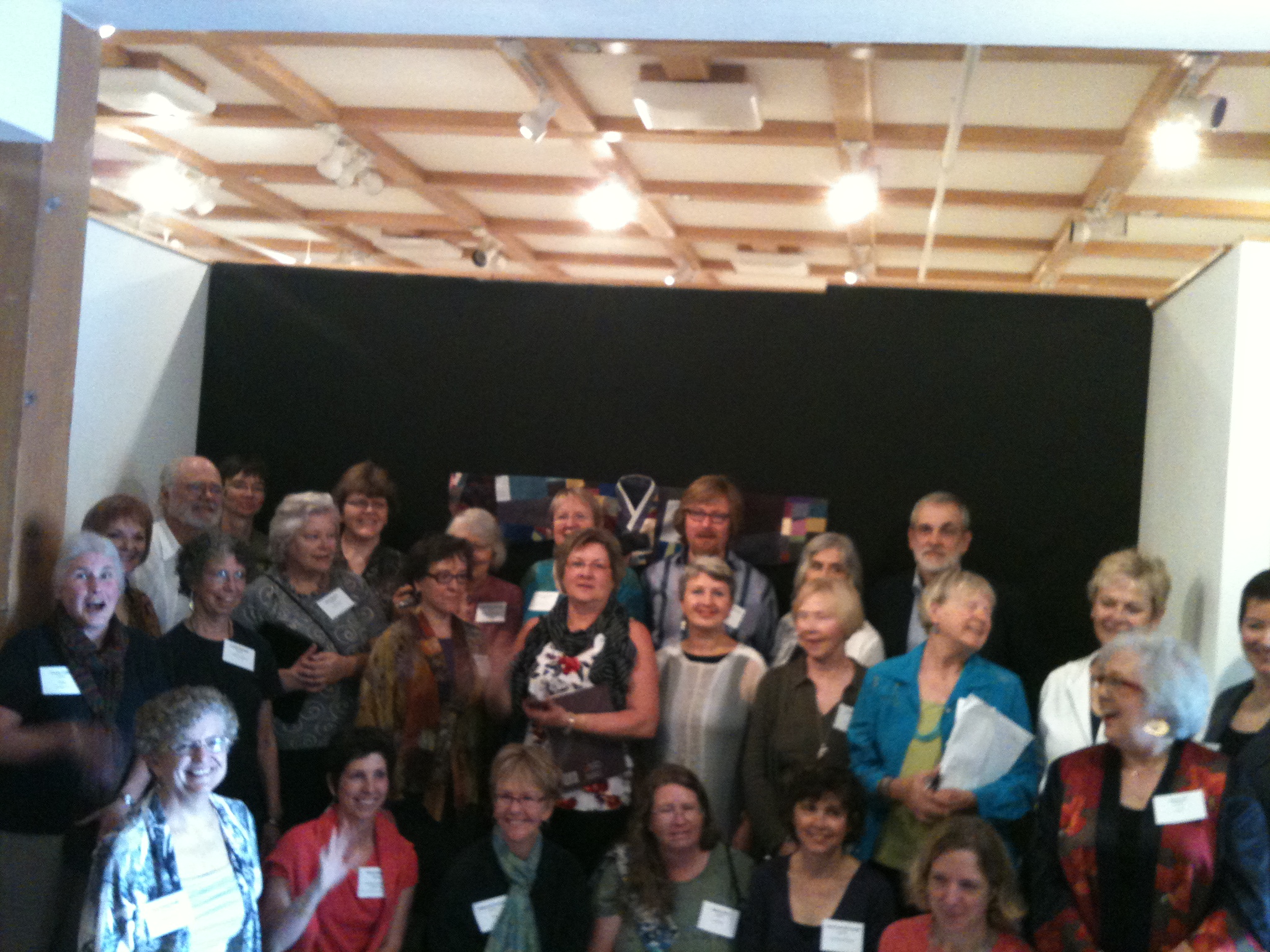
Here’s one of the group pictures (everyone dresses better than I do).

These came off someone’s phone…I never got a copy of a decent picture. I’m sure it exists somewhere. This is Sunday morning after the artist’s breakfast and talks.

This is the hallway outside, where we were eating breakfast and then signing catalogs.

Another photo of that. I came on Sunday in jeans and a T-shirt, knowing I was going directly to a soccer game after.

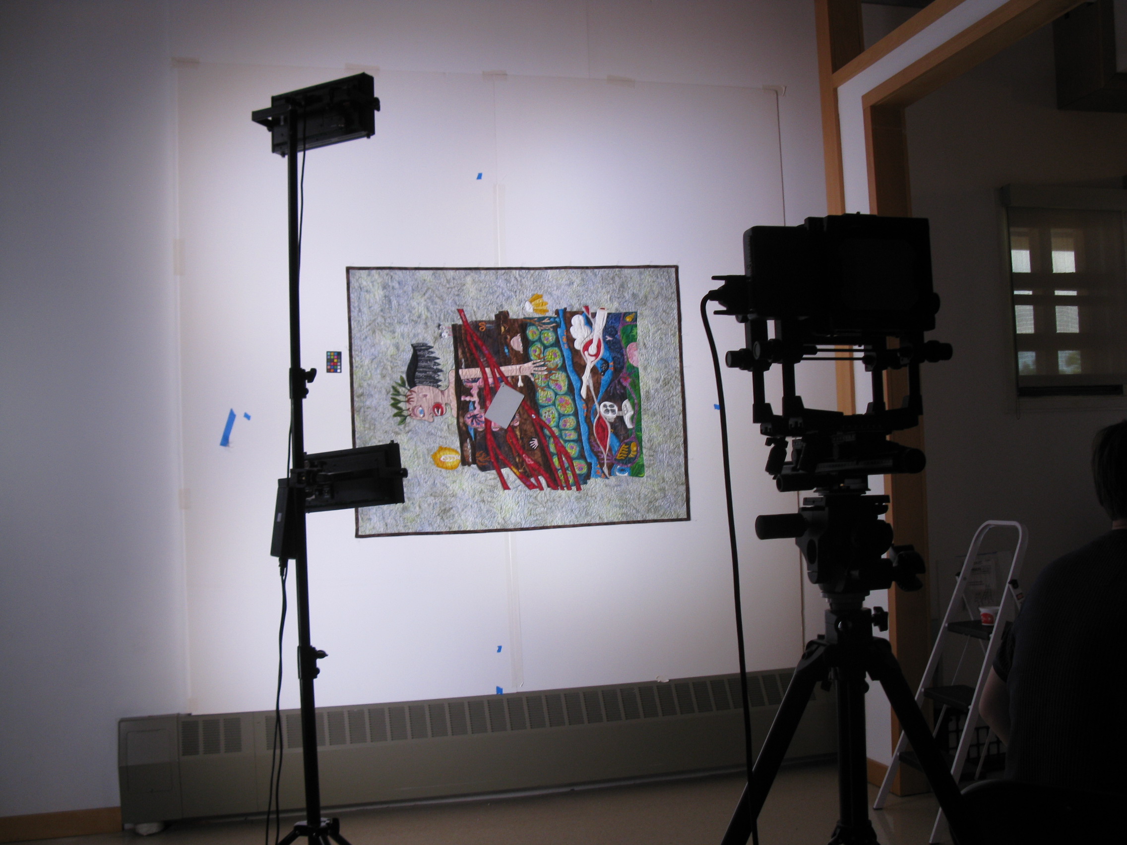
I have an insider at VAM who sent me photos of the catalog photographers shooting my quilt (sideways).

I’m so glad I don’t have to do this any more.

Finding a good photographer is the best thing I did for my artworld experience.

They worked hard. Interesting to see the computer analyze it as well.

Yup. Hair. Always.

Nice and flat.

Not sure what she was pointing out (a mistake? I do have them).

It’s nice to have work in professionally produced catalogs.

Anyway, if you haven’t seen the show yet, you should, because you don’t have much time left. You should buy the catalog, because it has great pictures and statements from the artists. It was a cool experience being one of the artists this year, instead of just the audience. Hopefully that will happen again.