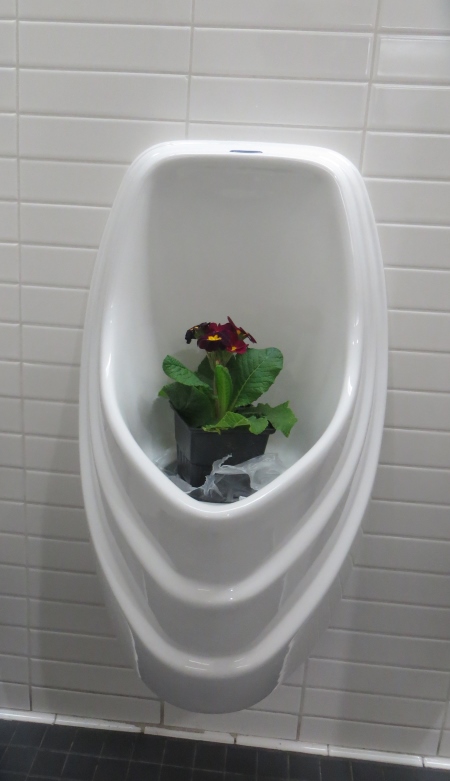
I know. It’s taken me a while. It’s been a rough month. Too much stuff going on. When I found out my piece was going to be in Road to California, I set up a road trip with Julie and my mom…Julie was really nice and drove us…first stop? The bathroom. The mens’ bathroom, which is kind of underutilized at a big quilt show, so they had made this one into a womens’ bathroom…complete with flowers in the urinals…you know, like you do.
Julie and I set out to try to understand the various categories of the show…I had entered Art, People, since, as it lists, “quilts in this category must illustrate some recognizable aspect of human form.” I think most of my quilts do that, but you have to watch Art, Pictorial, because it might be Naturescape AND People. In the beginning, we weren’t completely jaded about the categories…this is Sandra L. Nehlsen-Cannarella’s My Palette, which actually has a 3-D arm coming off of it to paint the still life.
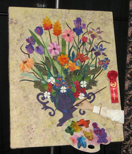
And is Art, Naturescape. OK. I accept that. I liked the arm too. Even though it’s cut off. It’s one of the winners…this link takes you to information on all the winners.
Then I had to photograph this Sue Spargo piece all in wool…this is the block-of the-month Imperial Blooms, now available in book form, this version sewn by Diana Tatro.
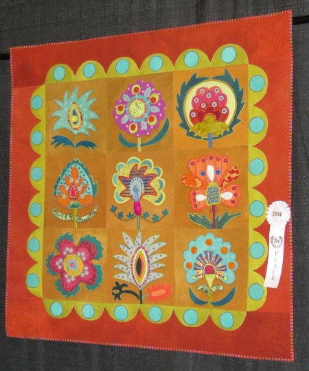
This is when I remembered that I was at a regular quilt show…because this is a pattern and it won an award…and it was even the BOM fabrics, so the maker didn’t even pick those? It was beautifully made, don’t get me wrong. It was under Innovative, Applique. Yes, Sue’s stuff is not traditional applique, but who exactly is being innovative here?
I photographed just one piece of this one, Magic Carpet Ride by Janet Wilson, because I liked the edge treatment…it was different.

By the way, I would love to link for websites on all these quilters, but if I can’t find them, I can’t link them. If yours is on here and I missed your site, please let me know and I will link up to it.
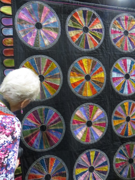
Always a crazy quilt fan, this one was a little too regular for my tastes, but I did like the edge treatment (there’s a theme here)…this is Gypsy Rose by Patty Johnson.
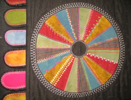
Here’s my mom’s head examining it up close…
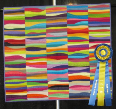
Two quilting friends with their pieces hanging side by side, Linda A. Miller’s Linear Moves and Sherry Davis Kleinman’s Geisha.

This struck me because of the triptych and the movement of color…this is Monument Valley at Sunset by Cathy R. Geier.

And these fish were very cool…this is Aqua Meets Marine by Gail Wax.

Lots of beads and scales on the fish.
These three caught my eye because of the metallic fabrics and the tight, very controlled and detailed quiltings…this is Odin’s Trilogy by Linzi A. Upton.
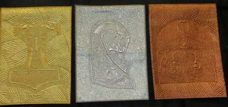
Really, you should go to her website just so you can see her quilted yurt.
I think that was the point at which Julie and I became jaded…for instance, there were lots of little quilt guild or group challenges, which I have taken part in at times in the past, but this one…it’s hard for me to be intensely critical because it’s not meant to be art, and the maker is certainly messing around with materials in a creative way, but I’m not sure whether Road wants to be a local quilt show (like the San Diego Quilt Show, which pretty much shows anything and anyone, except nudity) or whether they want to be an art quilt show. They’re not IQF…they’re more of a Mancuso show. I hadn’t been to Road for a while, and I used to go way back when it wasn’t juried, so it has improved, but I guess that’s it…it doesn’t want to be a big art quilt show. It wants to attract a lot of art quilt wannabes and traditional quilters…so I’m not sure I belong in it, honestly.
This is Bread #2 by Barbara Ulrey Schafer…a reminder of communion time…please note that the plastic tabs form the shape of a cross.

I’m hoping she collected bread bags from friends, because that’s a lot of carbs.
Sheila Frampton-Cooper’s piece on the left, The Ray, The Roses, and the Portal, actually worked quite well with the more traditional piece on the right, Hexahedron by Cecile Choi.
Two things going on here…first of all, Frampton-Cooper’s piece is Modern Piecing, a category that “should utilize improvisational piecing techniques,” and Choi’s is Modern Negative Space, which “should be set with large amounts of negative space.” I think this is where Road went a little bonkers…I’m not entirely sure where the lines have been drawn between art quilts, modern quilts, and innovative quilts, let alone traditional quilts with a modern look, like Amish quilts or even Gees Bend quilts can be. Maybe it doesn’t matter unless you’re crazy like me and Julie and you’re trying to see what is in which category and WHY.
The second issue was the fold marks…see the folding down the center horizon of both the quilts? Word is that those hanging the show had the pieces folded in half on the floor, so if you spent a lot of time ironing all the wrinkles out, it was to no avail.
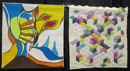
This is Valley Snapshots by Timna Tarr, Modern Piecing. Why is it not innovative? Not sure. Don’t know what the difference is.
It’s pretty, but…I don’t know what makes it modern.
This one is more modern to me…I actually really liked this, until I saw the orange…the orange was too much of a gimmick. This is Didn’t Get the Memo by Alissa Haight Carlton. I like that the triangles are more regular in some spots than others. This is Modern Piecing.

This one is Bias II, also by Carlton…this also has a more modern feel to me…this is Modern Negative Space. Sigh.
There’s some awfully arbitrary designating going on here. Because the one below? It’s Resonance by Heather Pregger, Art Abstract.
Don’t get me wrong; I like most of these quilts. I don’t like the categories. I guess if we just look at them as ways to give out more awards and more money, and maybe that gets more entries into the show, then maybe that’s a good thing, but I think it’s unnecessary categories that don’t really make sense. I can see trying to figure out what category to put an abstract piece into based on where you thought there would be fewer entries, so you’d be more likely to win money.
And here, to confuse the issue even more, is 369 Gees Bend Road by Rachel Keller, Innovative Pieced. It could have been Art Abstract. Someone might argue it into Modern Piecing. Who knows?

I put this in here so you could see the BACK of Alsea Highlands Falcon by Karen L. Donobedian.

Here’s the front, but I really liked the back.

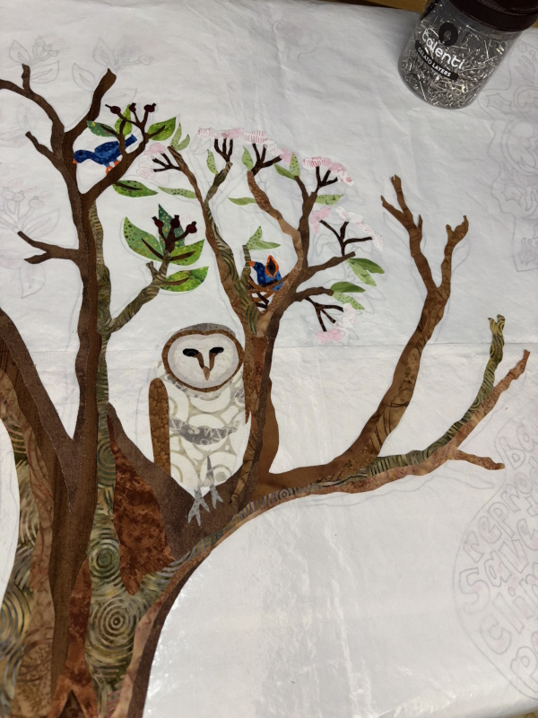
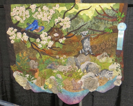
I put this one in here for two reasons: cool thread-painted raccoons and funky quilt shape. This is The Birds’ Perspective: Life at the Water’s Edge by Ann Horton.
This one was quite beautiful…at this point, Julie and I would walk up to a quilt and try to guess what category it was in before looking at the signage. This is Basket Weave II: SeeSaw by Ann B. Feitelson. This is Innovative Pieced, based on a traditional quilt pattern.
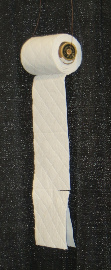
This…well, you had to put this one in…although the fuss about quilted toilet paper is now years old…this is The Real Quilted Northern, and strangely, it’s in the Miniature category, where it so does NOT belong. This is by Jerry Kay.
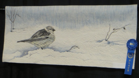
This was a beautiful painted bird, with lovely quilting lines for the show and the trees in the background. This is Winter’s Veil by Patt Blair.
This one is strange…I’m not against strange. Y’all know that. But this was strange. This is In the Beginning by Robert Hix. Aah. Makes more sense, hate to say…but here’s some freaky on this. I would totally put this in the Art Abstract section, but it’s in Modern Negative Space (say WHAT?). And then the statement…the statement says, “Sometimes simple designs are encouraged by a lack of decorations. Simple visual effects can be rendered quite tedious by actual techniques.”
Huh? OK. I’ve written some oblique statements in my time, but…I really want to know what this thing is about, and all I know now is that it’s tedious. And it reminds me of my new leach field.

This quilt, you couldn’t get far enough away to photograph the whole thing…it was hanging in an aisle space and 400 people were crowded around it…it was a prize winner though, so you can see the whole thing on that site above, but I really loved the quilting. Amazing. Not sure I care for the rest of it…it’s OK…but the quilting was amazing. This is Time to Catch a Dream (sigh…here’s where I give a big collective sigh to the need for quilt artists to have puns or crafty word use in their quilt titles) by Claudia Pfeil, Innovative Mixed.

Here’s part of it…like I said, you couldn’t get a whole picture of it. But Innovative Mixed? OK. Innovative is supposed to “implement fundamental deviation from traditional patterns and settings and should reflect growth through tradition.” Sigh. OK, if I stretch that definition, I can see innovative parts of traditional blocks and piecing throughout. I would still put it in Art Pictorial though…or something in the Art categories…although she won a big prize, so maybe I’m all wet?

Naw, she was fine…Best Embellished Surface…she could have won that from any category.
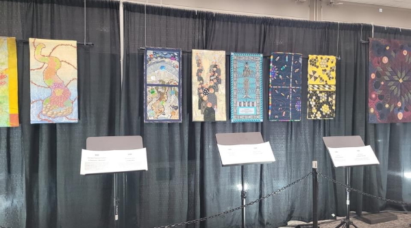
So here is my crappy picture of where my weirdo art quilt ended up in all of this…and I never got a better picture of the stuff around it. I think I was so confused and irritated by all the categories by then that I didn’t really care.
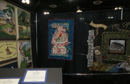
II was surrounded by Marvin and Ruffie (the dog) on the left and a dragon on the right. Where else do you put the only uterus in the show?
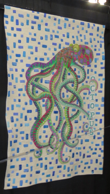
This octopus was great, but I do not like the background…it’s way too busy and detracts from the creature. This is Mischief Maker by Sue A. Wilson.
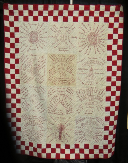
This is actually an old redwork quilt of signatures, part of the Lest I Shall Be Forgotten exhibit.
Here was a crazy quilt on a strange hanger in the same section…it would have been nice to be able to see it better…

OK, here’s a modern quilt, surely. Hell yes, this is Pods by Heather Grant, part of the QuiltCon exhibit…a modern quilt special exhibit separate from the modern quilt categories in the show itself. Grant is one of the founding members of the Austin Modern Quilt Guild, so she is sure she’s making modern quilts (and I agree with her).
This quilt was cool…Sushi III by Mary Kay Price…Innovative Mixed, in case you were wondering.

These two little sorta creepy dolls were by Nola Hart. I’m not usually a doll fan, but these were just creepy enough.

My camera had a hard time with this quilt because of the bright colors…but I loved the birds. This is Bad Hair Day by Martha Nordstrand, one of the Road Faculty. The birds are based on molas.

Here is David Taylor’s Maynard…nice use of negative space (but not modern), and you can’t turn away from a dog butt quilt.
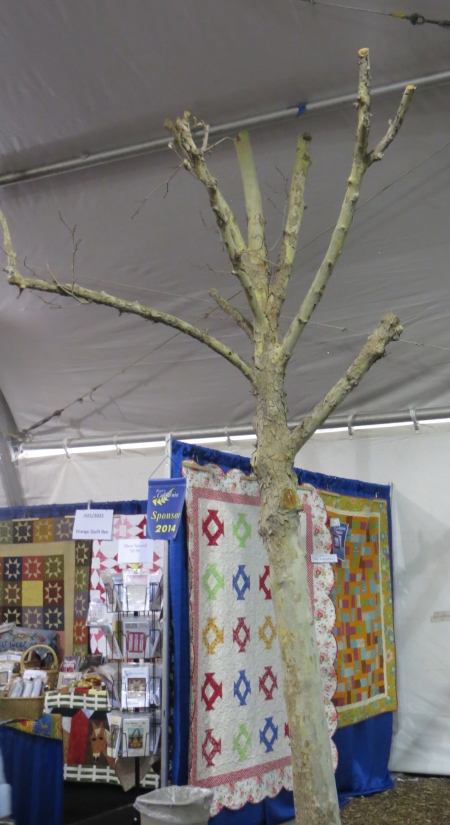
So the quilt show wasn’t just in the convention center…some of the vendors were out in the parking lot under these big tents, but the trees of the parking lot were in there too.

And some of them were a little worse for the wear (the sides of the ceiling sloped down near the edges and the trees no longer fit.
So. What did I think? I bought nothing. The vendors were a lot of the same stuff, geared more towards traditional quilters. I didn’t buy much at Houston either, though, so you shouldn’t hold that up as a pro or con. I thought the show itself really crowded the pieces in, I didn’t like the categories at all…I thought they were confusing and fussy and made very little sense. It was more a popular quilt show than an art quilt show. I’m not sure I’d enter again…is it really worth all that shipping and time and effort for only three days of exposure? If it were IQF Houston, I’d say yes (a lot more people and a higher level of art, I think), but I don’t think my stuff really belongs there. Will I travel up there to see the show again? Maybe. I’m not highly compelled though. It was worth the drive because I got to hang with Julie and mom and we saw quilts, but I don’t know that I would be that motivated to do it again any time soon. Your mileage may vary…I’m obviously kind of a fussy art quilter.