When I saw the topic for the first Art Quilt Portfolio, I knew I had nothing relevant. Although nature features largely in most of my work, it really is the human figure that has fascinated me for years. So when I saw the announcement for the second volume, People and Portraits, I was happy because that is where I fit.
(Maria Elkins’ piece Windblown)
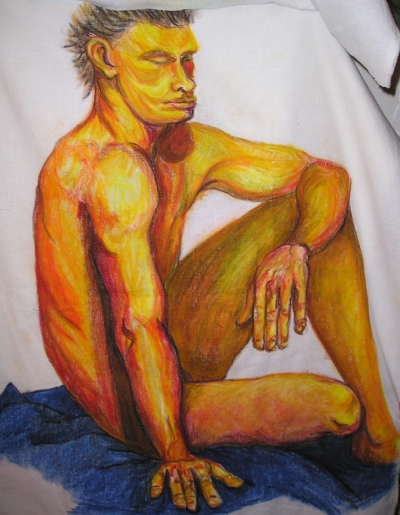
I have been using the human figure in my art since college, well before I started this obsession with fabric that is currently taking over my studio. I started with drawing people, taking life drawing classes as part of my college degree in studio art. I would try to figure out how the bones and muscles under the skin gave the body its form.
Way back when, I still ran off the page…(this is actually fabric crayon on fabric, one of the transition pieces from drawing to fabric work)
I was mostly a screenprinter (on paper) after college, and almost all of my work was of the human figure. As I began to consider having children, I switched to less toxic methods of printing, but I also found myself taking quilt classes and trying to figure out how to make the same images in fabric, because I could carry it around with me. Screens are time consuming to clean; you need big blocks of time to get the prints done. Fabric could be stitched in the tiny bits of time in between raising kids.
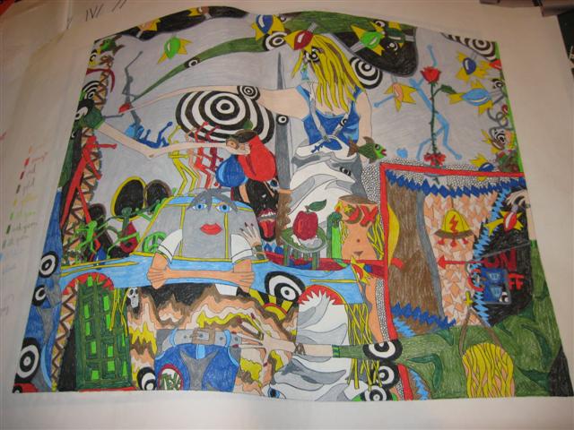
(a mockup for an old screenprint…I’ve actually considered making this a quilt)
I started with hand appliqué and moved from there to fusible appliqué. I still use hand embroidery on some of my quilts, but I also use ink to shade pieces. I still draw the image first, much like I did with the screenprints. I just use fabric instead of ink to make the image.
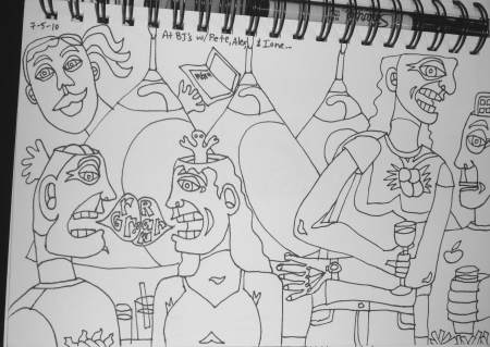
(the original drawing for Feeding Time)
Being one of the featured artists in Martha Sielman’s book is a real joy, especially because the book has such a wide range of styles of working. I also appreciate seeing some new artists and their work. I know Martha could have published three or four books under this subject with all the interesting work that’s out there, but the sections in between the featured artists show a bit of what others are doing with people and portraits in the fiber world.
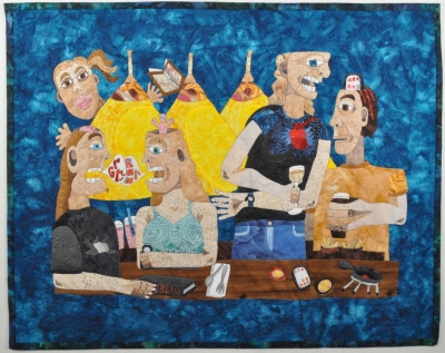
(Feeding Time completed in fabric)
This is my favorite kind of art book…lots of color pictures and variety, but also some meaty text about how and why artists do what they do. I could read books like that for the rest of my life and never get tired of them.
You can read my post here about Art Quilt Portfolio: People and Portraits from the end of March; I linked to all the featured artists in that post. I did do a giveaway back then…so sorry you missed it, but stay on the blog tour and I think you’ll find others doing the same. I knew I couldn’t handle a trip to the post office in the last 7 days of school…I’ll be lucky to handle keeping my head on my shoulders!
The blog tour continues through the end of the month:
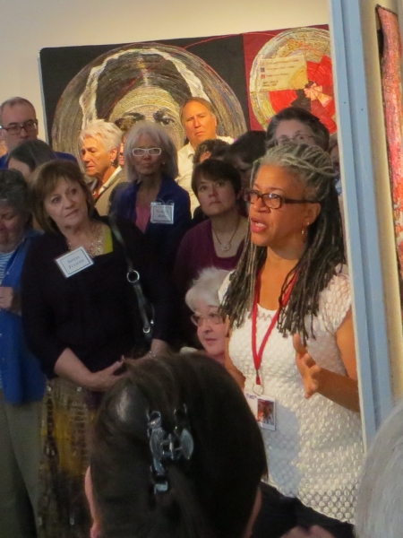
I suspect someone out there, like that one woman with the iPad who is in a lot of my photos of the artist talks, is going to post short, 2-minute videos of each of us talking about our art. Someone let me know when she does. I wasn’t that organized. I did take notes as people talked, and I tried to take photos of each artist with their piece, but the place was really crowded and I’m really short so I missed a bunch. Or I got just the top of their forehead. Needless to say, none of us looks awesome when we’re talking, except for maybe Elizabeth Barton (see below). Artist talks are always my favorite parts of any exhibit. I like to hear what they think, even when it’s just technique rather than inspiration. If I didn’t have a photo of the artist talking, I’ll talk about their inspirations/techniques when I post pictures of the exhibit later this week. For now, this is what’s intriguing me…people talking about their work.
I should also admit that I have barely looked at the catalog, let alone read statements yet. I’m saving that for when my head is less busy. I suggest you buy the catalog for the really good photography (unlike mine) and the official statements. I’m all about supporting art quilt endeavors.
This is John Lefelhocz‘s piece Mona in the Era of Social Butterflies.
When you look at this piece up close, you can see text in each box. John talked about the concept of a social butterfly and starting a dialogue, but the most amusing thing he said was “What would Mona Lisa say on her Facebook page?” I’ve seen a couple of parodies of famous artists dissing each other on FB. It’s an interesting take on the classics talking to the modern world. What is it to be a social butterfly these days? Is it the woman with 1000 FB friends that she’s never met?
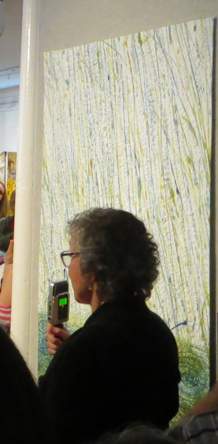
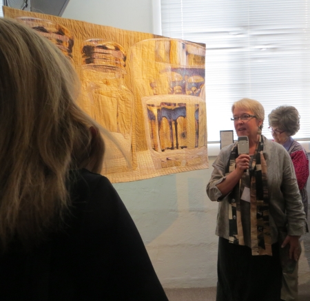
Charlotte Ziebarth talks about her piece Reverberations: Yellowstone Waters.
Charlotte won the Persistence Pays Award, with 9 entries over the last 16 years. I don’t remember how many times I’ve entered, but it wasn’t that many. She has some good background information on how she made this quilt on her website, on the right under Recent Posts. She is very interested in the patterns that water makes and using altered photographs. This is part of a continuing series and shows a dichotomy between hot and cold, using the geyser basins. What I find interesting about this piece is that it reads completely differently if you stand far away from it than up close.
Karen Rips is standing waiting for that funny-looking recording device we all had to talk into…the weird rainbow reflection on the top right of her quilt is not there in real life. Remember how I said my viewfinder wasn’t working? Yeah. Well, it wasn’t. Karen’s piece is called High Water Mark and is one of a series of three about the tides and how the body and emotions are related to tidal movements.
This is a very subtle piece and photographs don’t do it justice. There is a lot of detailed stitching in the black areas.
Cris Fee does a lot of drawing of live models, and sometimes self portraits, because she is an easy model to us. This is her piece Contemplating Self.
She likes to catch her drawing style in the quilt work. Everything is held in place with thread and paint.
Karen Tunnell does a lot of marbling on fabric. In this piece, Bubbles, she was trying to make the bubbles look like were sticking up off the fabric, using oil paint sticks and freezer-paper stencils, as well as trapunto techniques to achieve her goal.
It’s quite beautiful in person.
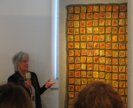
This picture amuses me. It’s Pamela Allen. I love her work. Is her work in the photo? Barely. Her piece is called My Town by the River and is very different from her brightly colored portraits with all their embellishments and stitching.
She explained that she had given her students an assignment to use toned-down, greyed fabrics, so she needed to do one herself. She has been working on a series of quilts of her home town. Her best quote? “I’m known for wonky.”
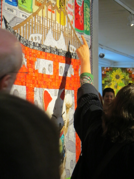
I missed pictures of Peggy Brown, Linda Colsh, and Susan Polanski, so next was Robin Schwalb, whose arm you see below pointing to Jive Boss Sweat.
Robin talked about putting pieces together from a bunch of cool places she’d been in Japan, including the beckoning cat, maneki-neko. The quote is basically that the native Japanese see differently than the tourists.
I missed photos of Kate Sturman Gorman and Dinah Sargeant, although I have pictures of their work that I will post later this week, and Susan Shie and Paula Kovarik as well. I don’t know how I missed so many…there were lots of people. I did take notes, so I know I heard them…I just couldn’t see them.
This is Mary Ann Tipple‘s piece The Conversation, between her mom and her dad. She joked that this was the second time her dad had been in Quilt National.
There was some interesting discussion about Spoonflower and other digital printing services, which I’ll ramble on about at a later date. She did use Spoonflower for the large prints.
This is Carol Goossens piece As Summer Slowly Fades. I was very intrigued by the coloring in this piece. Carol said she had a few months off of work and wanted to do a piece about summer turning into winter. She had started with machine stitching, but wasn’t getting a strong enough line, so she ended up hand-embroidering on it instead. It bugged her that she only had male birds in the piece, but the females weren’t going to show up…then she read that red-winged blackbirds congregate by gender in the fall, so she was happy to keep them all together in the quilt.
I’m certain I have a detail of this somewhere, but that will have to wait.
Elin Noble‘s piece Fugitive Pieces 11 is beautiful in person, and the detail in the catalog shows some of the specifics of that. She talked about emotions, memory, and grief, relating to the Canadian poet Anne Michael’s novel Fugitive Pieces and all the motions one goes through in life. Her love is for dye and fabric and thread…she even dyes the thread, but emphasized that she doesn’t dye the threads she uses on the back…that would be a waste, wouldn’t it? Unless you put the stuff you didn’t like on the back…
Across from Elin’s piece was Katherine Knauer‘s Solar City. Katherine has been doing a series on earth, air, fire, and water, and she liked the idea of a whole city running on solar power. She used a digital printing service to make fabrics with a variety of electrical symbols, referring to renewable energy; the sunflowers are made up of taxis, presumably running on renewable energy of some sort.
Nelda Warkentin‘s piece Bella Woods refers to the cycle of birth, life, and death found in the woods. She likes not just the standing trees, but those that are falling down. She uses the geometry of the line of trees to depict what we have in life, referring again to evolution and rebirth.
Laura Fogg may be known for her landscapes, so this piece Jammin’ is a departure from those. She drew some musicians freehand with her sewing machine and that turned into a quilt. I think the printed circles look like coffee cup stains, which makes sense to me in this quilt.
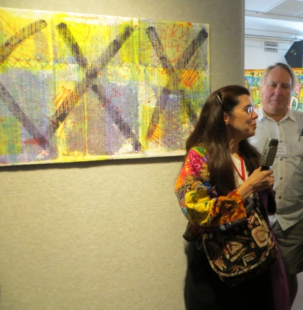
Cathy Kleeman‘s piece Post No Bills wasn’t working for her. She stitched it, painted on it, got stumped by the piece, and painted big black X’s on it to show it who’s boss.
Sandy Gregg was talking about her piece Listen to the Rhythm of the Falling Rain while someone else was talking to me (this might be my excuse for everything!), so I missed the first part, but I do remember her saying that she painted individual raindrops and added text to the bottom where the rain fell. I suspect I’m hiding a detail shot of this somewhere on this computer for later use.
Too bad I wasn’t on the other side to get a shot of her face.
I missed Lorie McCown‘s explanation, although for some reason I typed Frida Kahlo into my phone. I have a picture for later…her piece was very cool. I wish I knew why I typed that. I could ask her!
Susan Brooks talked about being commissioned to do a 9/11 quilt, but the fabric they made was ugly, so they each took a piece to do something with it. Her something included ripping it to shreds and putting it back together in this format, which made her think of her art group and the strength it gave her. This is Together.
Barbara Schneider‘s realistic leaves in Forest Floor, var. 2 are very impressively dimensional. She wanted to show things that were impermanent or decaying, but still beautiful, quoting wabi-sabi. There are about 100 maple leaves that were scanned, printed, stitched, stiffened, and shaped. The quilt is made in 4 sections and show distinct areas of light and shadow interacting.
I have a totally awesome picture of the artist there too, eh? I am short. What can I say?
This is Susan Lenz‘s Circular Churchyard, an amazing piece of grave rubbings from an historic churchyard in Charleston, South Carolina. The rubbings were done with permission in a graveyard that normally doesn’t allow this, over Halloween weekend…one wonders if any ghosts travel with the quilt. She talked about the ethereal nature of our lives and the passage of time through generations.
This is the first time I’ve met Susan, although I’ve emailed her with the I’m Not Crazy exhibit and I own one of her auction pieces. I love the work she does, and this piece is truly gorgeous in person.
Kerby Smith waits to talk about his piece Graffiti Series: Chain Link. This is an awful picture of it. Kerby announced himself as the photographer who quilts, and referred to tradition being tied with nontradition, as well as speaking about his focus on color and design. The pieces are linked together with large loops, like in a chain.
The next artist, Rita Merten (on the right), had Brigitte Kopp speak in English for her about Plastic Trees #5, Olive Grove in Ampolla, Spain. She recycled plastic bags for this piece, liking the idea of bringing the materials back to nature and making them into trees.
This is a very stunning graphic piece in person.
Lura Schwarz Smith‘s piece Passage refers to her mother’s declining memory. The drawing began on paper and includes digitally printed fabric.
You can see I wasn’t the only person trying to take photos.
I tried to get a decent picture of Sheila Frampton-Cooper and her piece From a Seed, which was inspired by one of her small watercolors.
I tried. She is an active talker…she did this as a whole-cloth painting with Procion thickened dyes and some paint sticks, but it’s the quilting that makes this piece. I’m sure I have a detail for later. She called this a subconscious drawing, and talked about trying to get the feeling of rain in the background, referring back to a seed growing into a funky plant.
I told you she was an active talker…
I missed Eleanor McCain talking about her collaborative piece Swaddling to Shroud–Birthing Bed with Kevin Womack. But here is Kevin talking about it…
The two talked about referencing traditional bed quilts, yet talking about what might happen IN or ON the bed, such as birth. There are digitally printed fabrics in the quilt, which is pieced from a variety of photographs of babies and prints of reproductive systems, as well as other things. Yes, I have a detail…later. I might be here for days on this one post if I don’t keep going.
Sandra van Velzen‘s quilt Behind the Facades is about Amsterdam’s canals and houses, what is behind the facades, referring to darker paintings from the era of famous Dutch art in the 17th century. This is a 3-dimensional piece, pushing out from the wall.
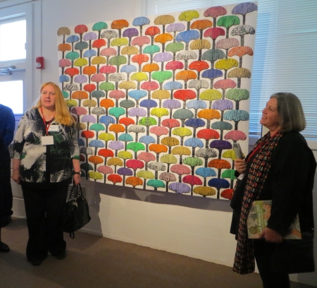
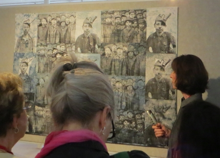
Patricia Kennedy-Zafred‘s piece about children and mining history is named Descent into Darkness: The Boys of the Mines. She uses historical images to tell the story. She won The Heartland Award for this piece.
At this point, I talked about my own quilt, and then got trapped down there for Lisa Kijak‘s commentary about her drop-dead beautiful piece El Cortez, Las Vegas. You can just see Sara Impey‘s Bitter Pills on the left side of the photo and Lisa Way Down There. Lisa’s recent work all draws from neon signs, showing the texture and passage of time. For this piece, she went to a neon graveyard (a cool idea in itself). She comes from a printmaking background (gee, I don’t know anything about that), so the positive and negative spaces have a different kind of importance. She uses thousands of pieces in each quilt, and if you go to her blog, she’ll tell you about one fabric in this quilt that was difficult to find. She also uses only commercial fabrics and tulle to help shade colors. I have details of this quilt for later.
I missed pictures of Kathleen McCabe, Judith Plotner, and Judith Content, and my photo of Kris Kasaki and Deb Cashatt dancing around with their microphones was amazingly bad, but their comment that they met 50 pounds…each…ago was amusing.
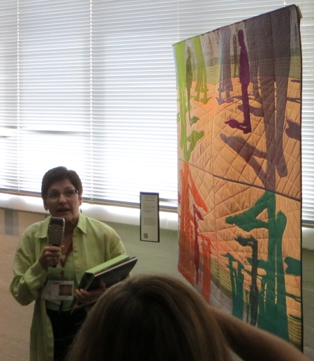
Pam Rubert‘s piece Seattle–Wish You Were Hair, referencing the Space Needle, is part of her vacation postcard series, if you think of those cards that say “Wish you were here,” but realize Pam is into bad puns. She uses world monuments to make really bad hairstyles, but showing that each place has an individuality to it that’s important. She mentioned that things are becoming the same everywhere, so looking for the individuality of a particular place is important…hence the buildings shaped like spools to match the needle.
Here is Pam herself talking about her quilt…
I didn’t expect her voice to sound like that, but I always have that problem…we imagine artists to look and sound a certain way (who knows why) and we are usually wrong.
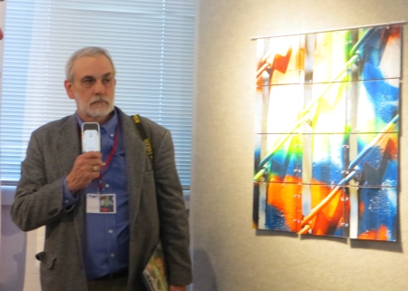
Kathy Weaver was another artist I had imagined wrong (I should stop imagining people, eh?)…this is her piece Biomechatronics Development Lab 2 v 2, based on a series of charcoal drawings of robotic arms made for soldiers losing limbs in war, as well as other people. She transferred her sketch onto fabric using a digital printing company, then airbrushed and embroidered over that. She liked the idea of using a classical drawing style to depict modern robotic devices.
This piece by Marian Zielinski, Goodnight, Sweet Prince, is a farewell piece to her father. She spoke quite emotionally about making the piece. The photos she used were taken as he was diagnosed with the illness that killed him. She commemorates his life by telling her story of her father. She liked the idea of using elemental energies to make the quilt: the sun for printing, the pigment for earth and water, dried by the air.
Marianne Williamson based her piece Hidden Falls on a waterfall in a cavern where there are no lights, the air sounds muffled, but water is falling. There is a timeless quality to the piece, as she imagined how the rock face might look as it is dislodged by the water and falling to the bottom, how water splashes and hits the pool below.
Susan Callahan’s piece 2 Top is based on her obsession with food and with setting the table before the people show up.
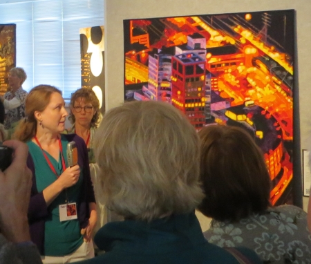
Kate Themel talked about the influence of light in her piece Morgan’s Flight. Morgan is the pilot who flew over the town in the quilt and provided her with reference photos for the quilt. She was trying to work with ideas of multiple sources of light or what if buildings were lit from inside.
I listened to Arle Sklar-Weinstein, Leslie Bixel, Bonnie Peterson, and Dianne Firth, but got no decent photos. I’ll talk more about their pieces in a later post. I do love Elizabeth Barton‘s piece Legacy and her face while talking about it. I don’t remember why it made her laugh. She started this piece about the environment in a smaller quilt, but used a picture of her grandson for the bottom section, supporting the oil derrick, which is much easier to see from far away (and doesn’t even show up in this photo). I think she was laughing because she had called her daughter and told her to drag the boy out of bed and put him in a particular position (what artist hasn’t done this?) and photograph him for this, and yes, she needed it right away. I think I have a full photo of this one for later too.
I missed Brigitte Kopp…or more accurately, I have a picture of the top of her head and even that is blurry.
This is Sidnee Snell standing in front of her piece Riveted, which is not even in the photograph. She talked about an infatuation with a steel bridge in Portland or nearby and all the photographs she’d taken of how the wind and rain had interacted with the paint. It’s a beautiful piece.
Miriam Nathan-Roberts was unable to come to the opening due to serious illness, so Judith Content talked about this quilt, Salt & Pepper. Content had to recuse herself from the jurying on this piece, because she had watched her friend take a very long time during her illness to finish this quilt, how she would take breaks for weeks and then come back to the piece.
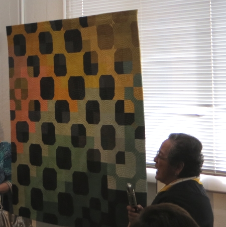
Cynthia Friedman is working with symmetry in her piece A Man among Giants. She was interested in the shapes of people and bodies and the shadows they make. Her quilts are often block-based and reflecting, but the blocks can be placed together in many ways for a different look. She uses a computer to mess with the photos and draws from there, using the computer to test symmetrical layouts.
Silvia Gegaregian started her quilt Bow Tie when she found some fabrics because she had to clean out her studio to remove the carpet. The fabrics spoke to her. She told the story that her husband doesn’t like this quilt and would say to her “You’re still working on that one?”, surprised that she continued to work on something he didn’t like.
This is Patty Hawkins‘ quilt Sunlit Canyon, based on the mountains she loves, trying to show the wear on the trees caused by elk and bear. She likes to play with the fabrics and uses deconstructed screenprints in her work.
I heard a few more people speak, but no photographs. I do have other photos of the pieces themselves, the gallery, and my favorite, detail shots, but you can only do so much in one blog post, and this is a LOOONNNGG one. I do like to document though, so you can blame it on that. The artist talk is always my favorite part, and I like to see what the artist looks and sounds like who makes the art, so that was worthwhile. Tune in later for more details on Quilt National 2013.
I know. I’ve taken a long time to post this. I like putting links to artists, so that takes time, but the closing exhibition is next Saturday (February 9) and the exhibit itself closes February 17, so I’d better do it soon or it makes no sense at all.
I loved the Oceanside Museum of Art space for showing Quilt Visions…it’s huge and has high ceilings and big open spaces (although it seems pretty crowded on opening night no matter what). I was concerned the Visions Art Museum space would be too small, too crowded. I think they helped a bit by reducing the size of pieces, but then again, you miss out on the giant VALYA felted face, the Velda Newman flowers, or Wendeanne Ke’aka Stitt’s Day of the Dead piece when you limit the size. So that’s a loss…that said, the show had interesting work, as always. The catalog is good for statements and all that. I have them going back 10 or 12 years, I think.
So they let the artists wander around and take pictures. I wasn’t very scientific about it, because I figured I had the catalog for good pictures of the pieces…I just wanted a general idea of the layout and the space.
This picture is the entrance to the back gallery (which is now the VALYA gallery). You can see from the left the tip of Dinah Sargeant’s piece, Velda Newman’s White Pelicans, which is beautiful in color and stitching, and Marilyn Henrion’sSoft City: Broadway Windows, which is digitally manipulated photography. I’m not usually a fan of that, but I like what’s she’s done here. In the back room, there is an image of most of Tiziana Tateo’sUnstable Balance and Barbara Lange’s Monochrom V-Quest, which has fluorescent thread that glows in the dark…interesting when you realize insects can see light waves that humans can’t.
This is inside the back gallery, with my piece Sediment on the left, then Patricia A. Washburn’s piece Neon Reflections on a NYC Skyscraper, Wen Redmond’sFirst Light, and on the other wall, Lori Lupe Pelish’sHey! OK OK piece, which is very cool and much more beautiful in person than in pictures.
Here’s a closeup of Pelish’s piece(s), which still doesn’t do them justice. She performs miracles with fabric patterns.
This is another view of that back gallery, with Pelish’s piece on the left, then Leesa Zarinelli Gawlik’s Wandering Through next to Tateo’s piece. Interesting that the two Italians were side by side. Notice also all the standing fans…this space is not air-conditioned, and with lots of people, it’s HOT.
This is the other corner, with Tateo and Lange’s pieces, and Valarie Robinson’s Homage to Federation, using the shape of pioneer dresses, then drawing and writing on the shapes with the sewing machine. It would have been nice with a colored wall behind it.
The last corner with Robinson’s dresses, my piece, and Washburn and Redmond’s pieces.
This is the small space right next to the back gallery (I really did photograph back to front). On the left is Joan C. Sowada’sAll the World’s a Stage, a small piece, and Kathy Weaver’sMimetic Concerns. I loved her robots and I still love her scientific pieces. They have a great movement and color in them. To the right is a great graffiti piece by Judith Plotner, Urban Vibrations. I used to take pictures of urban graffiti, and this piece reminds me of what attracted me to those places.
To the right of the Plotner piece is Carol Coohey‘s My Breath Coming out of Your Chest and Kerby C. Smith‘s Stone Stretch: Reflection, which was intriguing. To the right is one of my favorite artists, Dinah Sargeant, with her piece Leaping into Watersky. I got to meet Dinah finally and that was very cool…I love all her work.
Facing this gallery is Susan Cavanaugh‘s Ori-Kume #30, which has great threads running through and floating off the piece. To the right is Robert S. Leathers‘ Kings Canyon.
Looking further along that wall, you can see the right side of the Leathers’ piece; Nancy L. Cordry‘s Interjections; Lisa Kijak‘s complex The Stars Motel, Chicago; Katie A. Pasquini Masopust’s Pizzicato; and more (better pictures to follow).
This is the second gallery back from the entrance, with Nancy M. Condon‘s Kaleidoscope on the left wall, then Deborah M. Franzini‘s Vortex, and Ree Nancarrow‘s Black Spruce One (much better in closeup, check out the catalog).
Another view of Franzini and Nancarrow’s pieces, then Sandra Poteet‘s In the Wind, VALYA‘s Engrams.59, which was unfortunately cut off in the catalog; and Gail J. Baar‘s Lost & Found: Blocked.
On the wall closest to me is Kathleen Kastles‘ Name That Tune, a hand-painted piece. On the furthest wall is Linda Colsh‘s Twilight. I’ve always loved her work and it was a joy to meet her in person as well, for the first time. To the right of Colsh is Charlotte Ziebarth‘s Deep Pool, Bright Water, and Denise Oyama Miller‘s great tree piece, Sentinels.
This is a closer picture of Ziebarth and Oyama Miller’s pieces, plus Betty Busby‘s Growth Factor, stunning in person and in the book with details of the cell parts. It was nice to meet Betty as well…it’s fun to hear people’s voices and see them interacting, so the picture you have of them with their work makes more sense.
This is near the entrance, with Mary T. Buchanan‘s Isolation Gown on the left, then a view of the gallery behind, and Brooke Atherton’s beautiful Quilt Archaeology. California Fibers, the group I joined last year, awarded her with the Beyond the Boundaries award (and cash!). It’s a truly wonderful piece and very deserving of the award.
This is another view of Atherton’s piece, plus Viviana Lombrozo‘s Codex (very small…better in the catalog!), with Kijak and Pasquini-Masopust’s pieces on the other wall.
Pasquini-Masopust’s piece with Mary Pal‘s intriguing cheesecloth piece Solace, which was entered into I’m Not Crazy. I’m kind of glad it didn’t get in, because it gave her the opportunity to get it into Visions instead, and then I got to meet her. Terri Shinn‘s 3-D book piece Time Crumbles Things is on the pedestal next to Colsh’s piece.
This is another view of Pal, Shinn, Colsh, Ziebarth, and Oyama Miller’s pieces. The sound system was set up for something that day.
This is a closeup of the wall with Poteet, VALYA, and Baar’s pieces.
In the front, across from the desk, there is a wall with Won Ju Seo‘s A Korean Woman in Modern Times #1, which had the tiniest silk-thread stitches on it.
I know I missed at least one of the quilts in my photos, and like I said, the catalog does a much better job. I tried to find a reasonable link for all the artists, so if you were missed out and have a website, let me know and I’ll add it.
Here’s one of the group pictures (everyone dresses better than I do).
These came off someone’s phone…I never got a copy of a decent picture. I’m sure it exists somewhere. This is Sunday morning after the artist’s breakfast and talks.
This is the hallway outside, where we were eating breakfast and then signing catalogs.
Another photo of that. I came on Sunday in jeans and a T-shirt, knowing I was going directly to a soccer game after.
I have an insider at VAM who sent me photos of the catalog photographers shooting my quilt (sideways).
I’m so glad I don’t have to do this any more.
Finding a good photographer is the best thing I did for my artworld experience.
They worked hard. Interesting to see the computer analyze it as well.
Yup. Hair. Always.
Nice and flat.
Not sure what she was pointing out (a mistake? I do have them).
It’s nice to have work in professionally produced catalogs.
Anyway, if you haven’t seen the show yet, you should, because you don’t have much time left. You should buy the catalog, because it has great pictures and statements from the artists. It was a cool experience being one of the artists this year, instead of just the audience. Hopefully that will happen again.
Well, finally. I have gotten into Quilt National2013, and I’m in Quilt Visions 2012. Now I can stop making art. I have accomplished my two goals and there is nothing left to do. It was nice knowing y’all…I’m going to move on to something else.
…
Yeah. Right. Because I don’t have 1700 quilts still clamoring around my head to be made. Because I haven’t been an artist since the day I was conceived (sorry mom, dad…I know it wasn’t necessarily something you planned.). Because it’s not in my blood, my heart, my brain, my…well…probably uterus. Home of all creation, right? Well, this is the creation I’ve been working on since very early on, and I’m unlikely to stop now.
Do I have permission to buy more fabric?
It is a strange feeling, though. I had convinced myself again that all the acceptances had gone out yesterday, per the calendar, and that I was just waiting on rejections. I got the email about 20 minutes before school started. I called the boyfriend, who wasn’t even awake. I called my mom during my prep, and she’s already calendared the opening. I emailed the ex to save the weekend now, before he plans another trip to Vegas. I danced around the house for my kids, who are of course supremely annoyed by me and confused by my art, all at the same time.
Here are all the accepted artists, an interesting list to say the least. I’m looking forward to seeing quite a few of them in Athens. Woo hoo!