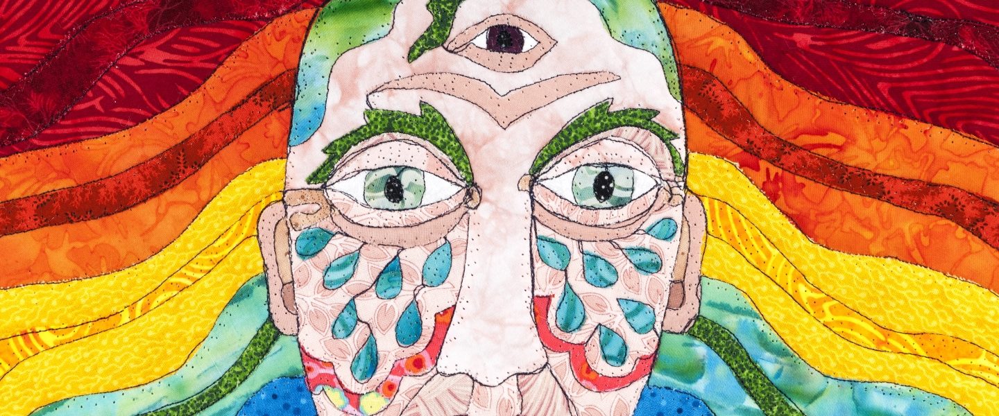
IQF Time Warp 2

I love that it takes me 9 months to finally get through all these photos. I’ll still be writing about the Scandinavian trip in 2012 probably.

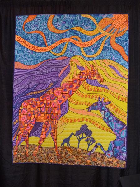
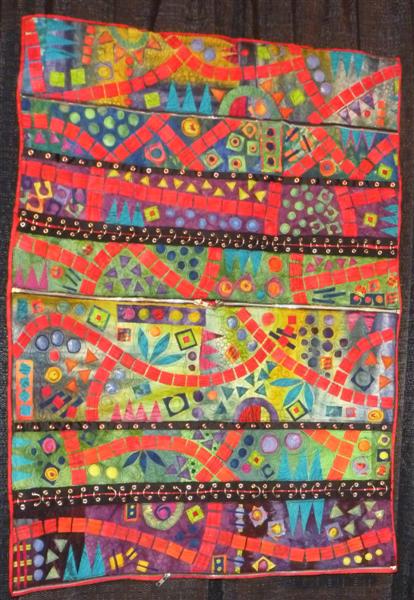
This funky quilt is Color Comes to Back of Beyond, and is based on a colored-pencil drawing by Pauline McPharlin. The quilters are Janice Munzberg, Pam Holland, Pauline McPharlin, and Jeanette Coombes.
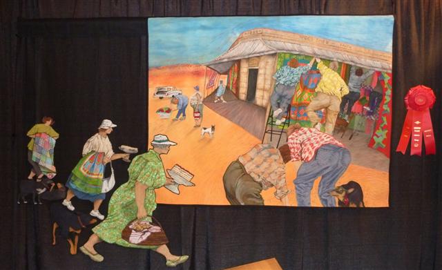
The group has done an amazing job making a drawing into a quilt, with the elements coming in from the left and the thread-painting used throughout the piece.
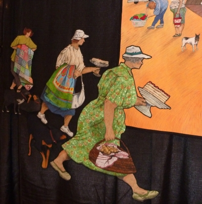
I wish there were somewhere they had written about the process they used; with 4 people involved, one of them a teacher, I’m curious how the delegation of work happened.
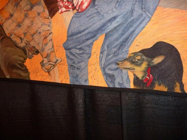
Here’s another piece of it.

This one looks like knees and legs to me, all under a big patchwork quilt. This is Pinnacle by S. Cathryn Zeleny, the title implying nothing to do with knees, of course.
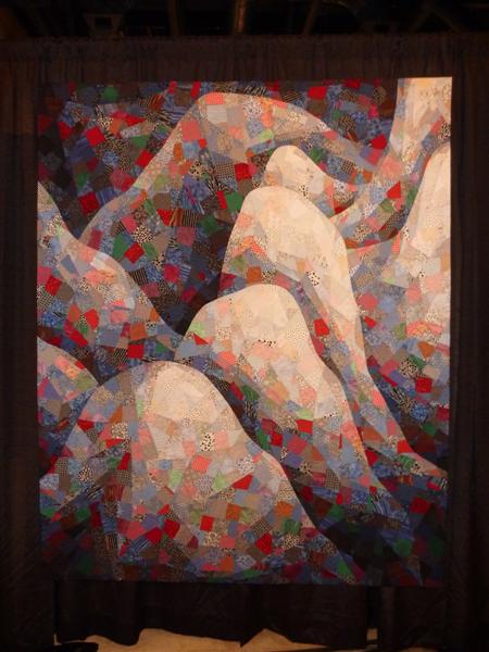
The only other image I could find of a Zeleny quilt used a traditional quilt pattern to create these 3D shapes just like this one.

I know this is at a lousy angle, but there were 7 million people in front of this award-winning quilt, Mary Simon Rediscovered, by Nancy Kerns.
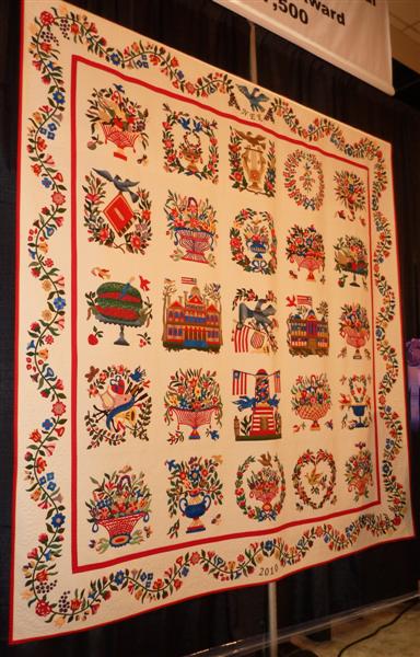
The pattern for the Baltimore blocks is a reproduction of a quilt by Mary Simon and can actually be purchased from the DAR Museum in Washington DC. Kerns designed the floral border herself and tried to stay true to the colors of the original piece. I’m a sucker for a nicely done Baltimore Album…it’s better to collect pictures of them than to try to do it myself, right?

I also like crazy quilts, and this one had a unique setting. This is Linda Steele’s Eastern Elements.
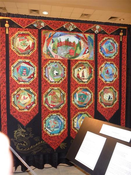
I’ve shown her crazy quilts here before (like one a year, I think).
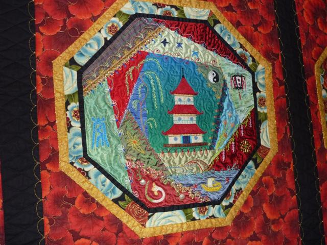
The detailed embroidery and the settings for the blocks make her quilts stand above and beyond many crazy quilts.

Allison Aller’s Crazy in the Garden was inspired by the spring weather in her own garden.
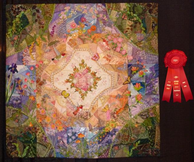
Aller’s control of the color in this piece is very impressive. If you read her blog, you can watch her put this quilt together and make decisions about what goes where. Unfortunately, this piece went missing from a recent quilt market in Salt Lake City, Utah, along with 3 other quilts. C&T Publishing is offering a reward; details are here.

This is Kathy York’s Doors Across Austin.

You can read her statement about this particular quilt here. She dedicates the quilt to her son, who is autistic and doesn’t like change but does like novelty and bright colors. Although I photographed this quilt before I knew it was about her son, it was the mention of Temple Grandin that made me look twice. Temple Grandin is an autistic woman, writer, professor, consultant to the livestock industry on animal behavior, and doctor of animal science who has spoken up for many autistic people, showing the rest of the world that autism is not some sort of strange disease, but advocates early interventions and teaching coping skills. She has written a book about what it was like to grow up autistic, I’ve seen her in a few documentaries, and she has changed how the livestock industry deals with restraining and slaughtering animals, suggesting more humane ways to accomplish the tasks. In the video I watched, she actually gets in pens with the cows and lies down on the ground to get them to respond to her. The Woman Who Thinks Like a Cow is available online in pieces. I linked to the first portion on YouTube, if you’re interested. I’ve watched the whole thing…she has interesting comments on her childhood and her understanding of the bovine mind and how they’re linked.

This is Betsy Abbott’s Tidepool Treasure. This piece has lots of details…
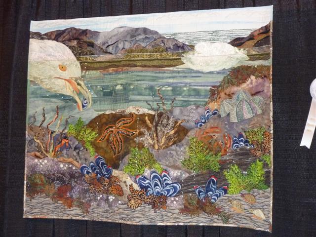
but the bird’s head intruding on the sealife below is what really makes it interesting.

This is Rachel Wetzler’s The World, including work using Inktense pencils and Micron pens.

She writes a little bit about making the quilt on her blog, showing her inspiration from an antique map. Some of the animals are painted directly on the fabric and some are fused on. If you search through her posts for those titled The World, you can see some details and get more information about how she created each portion of the quilt. Note Adam and Eve peeking out in the center middle.

It’s an orange rhinoceros with blue hooves…it’s actually quite a beautiful creature, My Rhino by Pam Holland (same Pam as the one above, I believe).
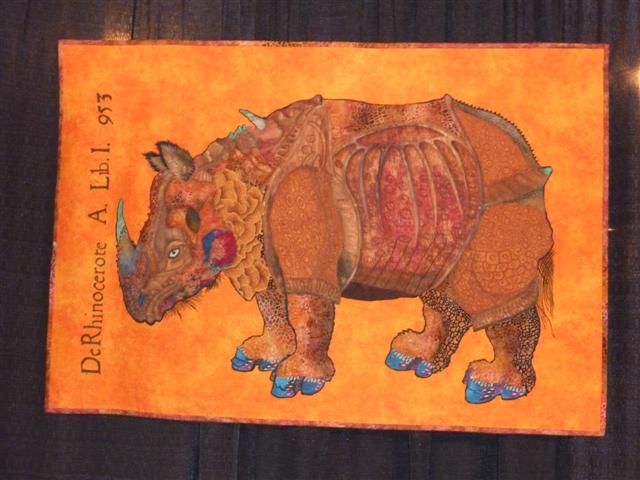
This is an Albrecht Durer illustration from a few years back (1500 AD). He looks a little cranky carrying all that armor.

The totem pole is beautiful, but the delicate lines of the trees really make it stand out. This is Promise Fulfilled by Kathy Quinn Arroyo.
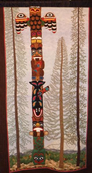
This is not a real totem pole; she studied the meanings of the different creatures and made a pole specifically for her family.

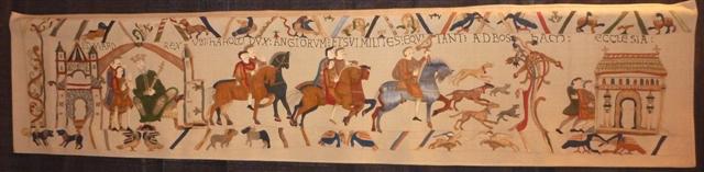
This is a very long and narrow quilt that is a study for a quilt reproduction of the entire Bayeux tapestry, a mere 238 feet long. This is Pam Holland again, who seems to have a lot more free time than I do, and is producing some very interesting work in that time…
Here is a closeup of one of the sections, so you can see the incredible detail she is putting into this sample.
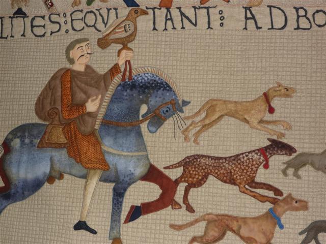
I love his mustache. What’s also interesting is that I really didn’t pay attention to who made quilts when I took photos in Houston…I just took photos of what I liked and then a photo of the card, but I didn’t read the cards most of the time. I was all into the visual experience and didn’t want to mess it up with words…so for many of these, it’s the first time I’ve read the statement (or connected the fact that I photographed multiple quilts by the same artist).

This doorway was stunning. This is Facade by Melissa Sobotka, who compares the crumbling doorway to her own aging self, finding the original structure still apparent.
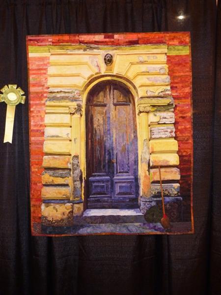
This doorway is in Tuscany.

This quilt reminded me of some drawings we did in my beginning Visual Arts classes in college, where we drew real objects and then combine them all into one drawing, then erased bits and pieces to get a final composition. This is actually a train; the piece is called The 844, by Lynne Pillus.
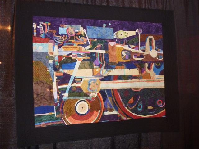
I like the mix of all the parts; you can tell it’s part of a train, but it’s not obvious and it’s colorful too.

A Noriko Endo piece…they seem to get more delicate as she gets more experience with her own technique. This is Radiant Reflections #2…
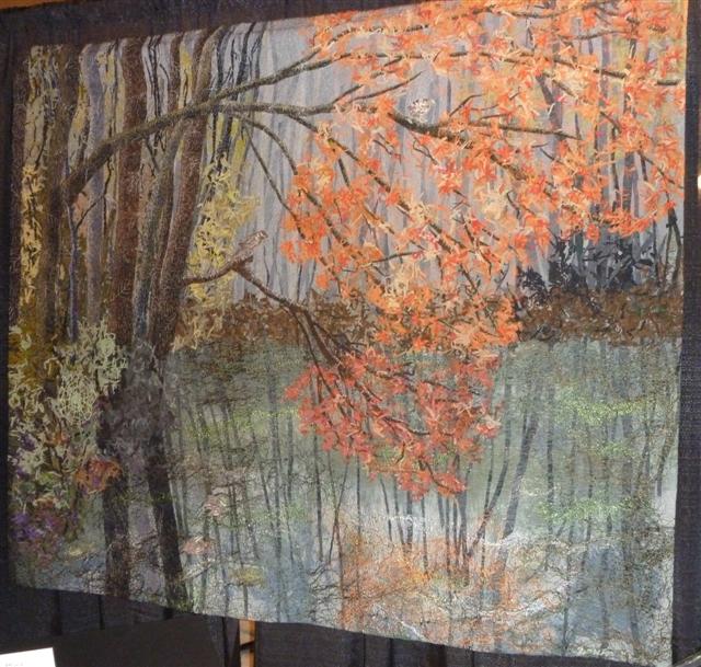
She writes that she is working on a series of reflection pieces, and you can see the orange of the leaves in the water.

The strange shapes and traditional blocks in the sky caught my eye with this piece, Sandstorm over the White Desert, by Jenny Bowker.
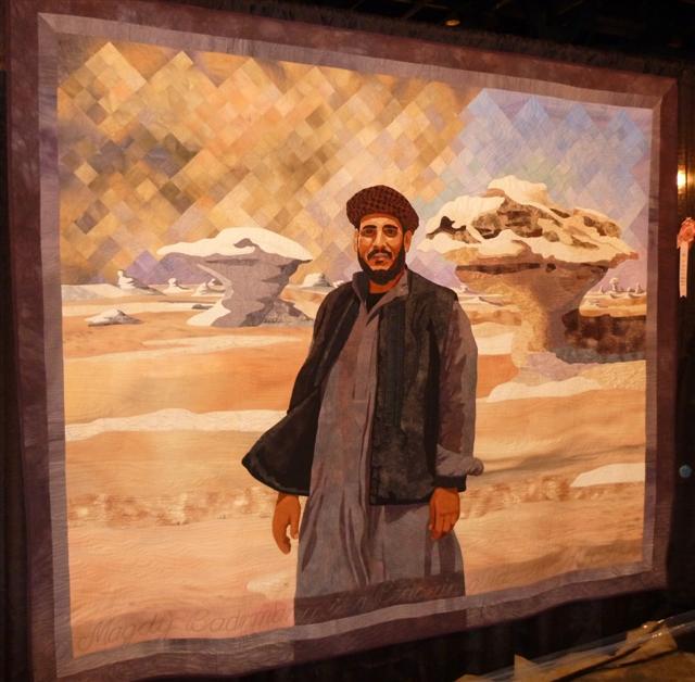
When she travels, she photographs people (and stuff) and then makes quilts from her photographs. The background may have originally caught my eye, but it was the face that made me photograph the quilt…
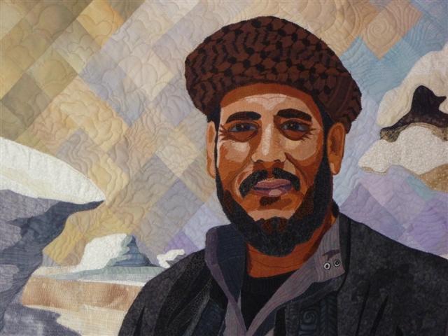
And check out the sandstorm building up in the quilting behind him.

I obviously will need one more post to get through all of these…plus I am trying to get quilting done in between. Really. I am. It is nice to go back and review these from November, though.

IQF Time Warp

So I realized I had never posted quilt photos from IQF Houston last November (welcome to school brain), and I started looking through them…and then I was thinking about what I actually SAW in Long Beach, and I think my tiny little brain just realized that we don’t actually see all the quilts in the show in Long Beach…that some only go to Houston.

Well, that sucks. I loved Houston last year, but it’s expensive and the timing sucks for a single mom with two kids who play soccer and who happens to be a schoolteacher, so it’s unlikely that I’ll be able to go again for a few years. So I guess that means I always miss out. Please don’t remind me that I don’t ever go to Quilt National or the Mancuso shows, so I always am missing out. I don’t want to be that enlightened until I get all the way through this cup of tea.

Anyway, so consider yourself in a time warp back to November, when the weather was not warping your brain so much (well, if you’re living here in San Diego, right now East County is a bit on the warm and humid side, but not really as bad as last year at this time, so I should shut up and stop complaining), and enjoy the quilts.

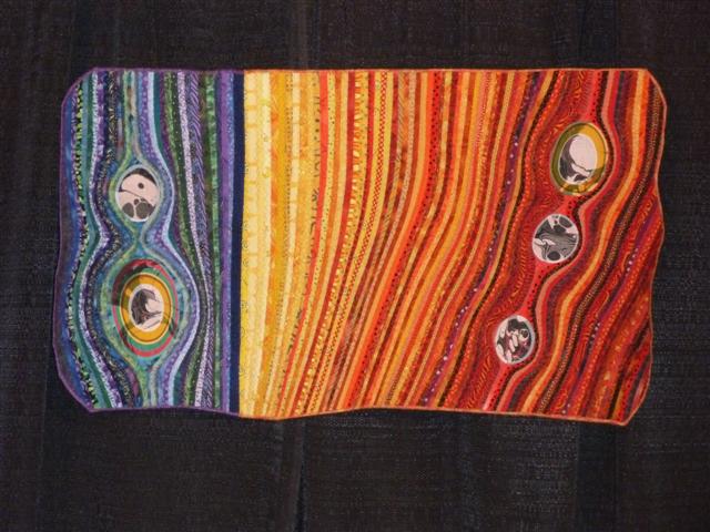
This is Stone II by Jean Wells Keenan, which was apparently inspired by a Rosalie Dace workshop.

The colors and use of the patterns in the fabric in this piece are really beautiful. Her website above has many more examples of her work.

If you know anything about Jamie Fingal, you’ll recognize her use of metal attachments in this quilt, Square Dance.

I stared at it for a long time, trying to figure out if it fit together in a different way, with all the squares lining up.

This is Swimmers’ Clock by Julie Duschack.

I have to say, I had to go check her website and google this piece to make sure I hadn’t photographed the wrong statement, because this doesn’t look like the work I associate with Duschack, but it’s hers. I liked the graphic quality and the balance in this piece.

This is Tanya Brown’s Siesta, which is much more amazing in real life (it’s bigger than I had expected).

I’m quite happy to let others do this kind of intensive threadwork, and it pays off in the texture of the wood and the raccoon.

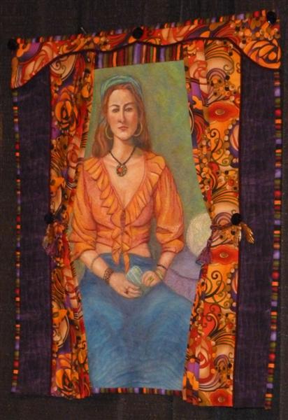
This is The Fortune Teller, another piece by Sherry Kleinman.

It includes another painted figure with the 3D embellishments of the curtain around her.

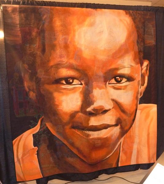
Hollis Chatelain’s piece Innocence is large and bold, but what’s really amazing is in the quilting…

You can see shadows of it in the picture above, but she’s quilted faces of children into the larger face (as she dreamed the original image)…

There aren’t just a few faces…there are a ton of them.

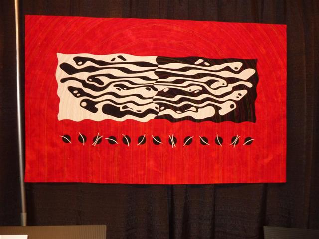
This is Sticks and Stones 2, by Joan Frantz and Pat Cookson.

What’s interesting about this quilt is first of all how the reds make the whole thing feel like it’s leaning, but that Joan died in 2008 and this is one of her last quilts, and Pat finished the quilt for her. I started thinking about who might finish mine for me…if the top were done and all you had to do is quilt it (yes, Susan, I know you’d do it, but you’re older than I am…presumably I might outlive you…although Joan died early of ovarian cancer). Yes, this is a depressing topic…but something to think about.

Looking at all these, you might think I like bright colors…this is Judith and Bill Woodworth’s 3 Gs.

Judy designed and quilted it, and Bill painted it. I could see making this in commercial fabrics, but it’s actually a wholecloth quilt.

Inge Mardal and Steen Hougs painted and quilted this piece, Angling.

I love the cover picture of them on their website. Definitely watch and read the “About Us” section on their website. I’ve always wondered how two artists might work together to create one piece…they seem so calm and focused. I think I don’t have the right personality to be so calm while working with someone else.

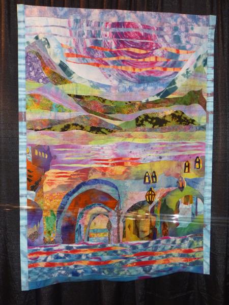
I saw this one in Long Beach too, and almost took another photo of it, so it’s a keeper. This is Village in Galilee by Rachel Covo. (wow…Wordpress did it again…deleted a big part of the post when I published…what a weenie! Fixing it now…).

Covo talks about cloudless skies and the strong sun of the Mediterranean (reminds me of home). The colors and movement of this piece is what I liked.

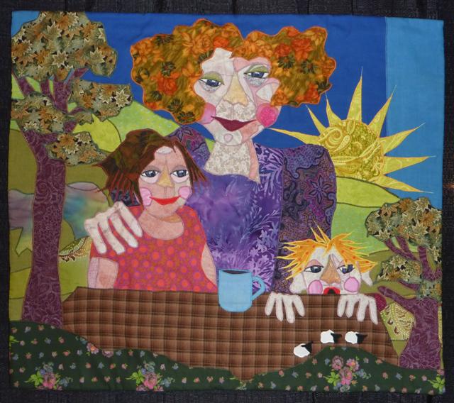
It’s a Bodil Gardner piece, of course, featured many times on my blog. This is Tell Us a Story.

Gardner describes a mother telling stories to her children and the living room turning into Storyland (hence the sheep on the table). Gardner lives in Denmark, but not in the tiny bit of Denmark where I was this summer. If she had, I might have tracked her down and talked to her about her work (and asked to see her fabric stash). OK. No I wouldn’t. I’m really not a crazy stalker lady. Although I did see textile art this summer…I only went to places that we found in the arts booklet that was all over Skane in Sweden…so one would think they would expect me to show up, eh?

Another regular to my blog, Pamela Allen…but this piece is different from most of her other pieces…this is Water Garden in a Quasi-Egyptian Style…

It still uses the funky details of fabric that she uses, but it seems more graphic and stylized. Allen talks about Egyptian art shows all views; perspective is skewed so a person might be facing three different directions at once. She has used that technique with the water garden.

So that’s all I did today; I’ll do more tomorrow. I can only handle so much time-warping in one day, especially when WordPress keeps eating my words. It must have some serious indigestion.

Quilt National 2011

Plenty of people have posted about QN who were actually there…some of us weren’t able to see the show in person, so the book is our only option for viewing the exhibit. I’ve reviewed QN (and Visions) in the past, and I often wonder about the concept that these two shows are supposed to be examples of the “future of the art quilt medium.” Maybe it’s because I come to art quilts from the other art world, and there is very little I would consider cutting edge…which isn’t to say there isn’t plenty I see that is intriguing, entertaining, interesting, and worth viewing.

The plus of having the book available us is an introduction better explaining the jury process, for those who can’t imagine choosing 85 quilts out of over one thousand entries. I know a different jury would have picked a different show.

The other plus of the book are the juror statements. Nelda Warkentin specifically explains why many of the award-winners received their awards. It’s not artspeak…just simple explanations that explain her feelings about those pieces.

Eleanor McCain asks what makes fabric and thread a necessary part of these works of art? She also talks about the place of the quilt in the art world and in history, especially as it relates to women and their place in the art and domestic worlds.

Pauline Verbeek-Cowart is a weaver, and as such, brings a different viewpoint to the jurying. I was interested in her comment that she was looking forward to seeing something new and different, something that would show new direction or would inspire her to new directions in weaving…and she “was initially disappointed” by the lack of “groundbreaking new approaches,” such as those she has seen in the rest of the fiber world, mostly technological advances, like the use of digital technology to create truly new types of work. I personally don’t feel the need to explore new materials at the moment just because they exist…that may change in the future, but for now, I an more interested in how best to convey what I’m thinking.

Another thing about juried shows is realizing that you can’t possibly make a quilt aimed at the specific jurors’ styles. With three jurors voting throughout, the final exhibit is what they all agreed on, whether their personal preference is all brights or stuff with metal bits or really abstract.

In talking about the quilts themselves, I must admit that I’m only looking at pictures in a book; I would love to see them in person, but I am limited by my location far far away from Ohio. That said, I always, as a more pictorial quilter (I’m not sure there really is a word for what I do…figurative? surreal? graphic?), I am always cognizant of the fact that the majority of art quilts in QN seem to have either a block-based construction or are truly abstract (or both). Perhaps it is because the medium is based in traditional block construction and that is where most quilt artists hale from…they started with the 9-patch and strip-piecing and branched out from there? That said, there are always those working in blocks whose work transcends the structure…Wen Redmond’s Leaping Point goes well beyond the block…and beyond the limits of photography as well…I love to see photography used to further the image, instead of just BEING the image…she’s incredibly successful in this piece on both fronts. You can see Wen and her piece on her blog here. Deidre Adams’ work Facade VII also mutates the block with the use of paint over the constructed piece, with the numerous quilting designs emphasized by the paint. The block is there, but does not own the piece. Deidre’s blog has an amazing post on the opening of QN 11 with pictures of many of the attending artists with their pieces. I would suggest her blog as a good read for general information on fiber art in general, as she had a good number of posts about the SDA conference as well.

The abstract pieces (including the block-based pieces) dominate the show. Although I don’t work very abstractly, certain of these pieces do excite me…I wish I could see Kim Shearrow’s piece Sunrise at Age 45 in person. It’s created from recycled materials and looks to me like the sun is rising in the piece. I can’t find a website for Shearrow, but I did find this video of her talking about how she started quilting with tissues. It seems that experimenting with different materials is her thing at the moment. Caroline Szeremet’s piece Oil Spill is another abstract piece that caught my eye, with the quilting seeming to add to the piece…it’s hard to tell without a detail whether all the stripy bits are from quilting or whether they are from paint (I suspect a combination of the two). Her piece Oil Spill 2 was recently in Form, Not Function 2011 also. It’s hard to tell from her statement whether she set out to make quilts about oil spills in particular…she says “The title comes from the impression this work naturally evokes”…but I definitely get a sense of world and nature from both pieces.

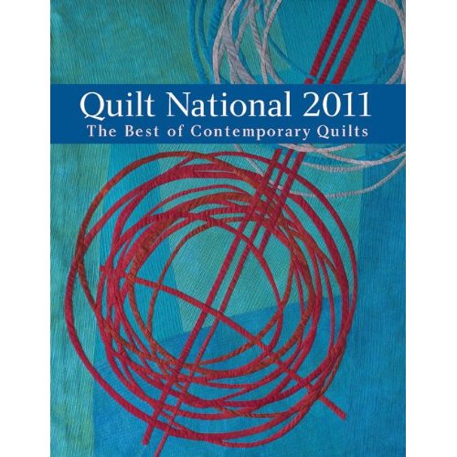
Continuing with the abstracts, Judy Rush’s piece Portrait of the Youngest Girl 1 attracted my attention, largely because of the repetition of the star shapes across the piece. I actually liked it better before I saw the title…I didn’t see a face until then, and it just was this shape almost like the human heart, very abstracted but with movement around and through the piece. If you go to her website, in the 2010 gallery you can see the piece that got into QN, but also two other pieces in the series. The star shape repeats throughout quite a few of her pieces, but I like the second portrait the best…it seems more interesting in terms of shape and stitching, although it may just be that it looks the least bit like a portrait…I’m not sure why the title set me off so much, but now I can’t even look at it without seeing a face. Strange. Judy Kirpich’s piece Circles No. 4 (the cover quilt, seen above on the book cover) also caught my eye…the graphic nature of the overlapping red circles are made even more interesting by the addition of the turquoise and silver circles above. I just added her blog to my reader after skimming through her comments on how she creates and how sometimes she doesn’t know when to stop making circles and lines. Elizabeth Brimelow’s piece Rook Road caught my eye at first, but it wasn’t until I saw the piece fullsize on someone’s blog at the show that I realized it was even more interesting than I had thought, with the pieces scrolling over the top bar and onto the back. Her explanation is that this is the view of the land from the rook’s point of view, like a map of where to find food and water. In looking her up on the web, I realized I’d seen and admired her pieces before, although this one does not obviously follow from the others.

Dinah Sargeant has always been one of my favorite quilt artists, and although I don’t really consider her piece Pink Dog Blue Rain abstract, I guess it technically is a mix between abstract and picture. There is just enough of a real picture there to see more happening than she explains in her brief statement “Fragments from the day gather in the night”. I’m always intrigued by her process, and she doesn’t give many details about that, but in her statement claims she starts with paint, and then “I venture into a world of colors and shapes, where ethereal creatures and places beckon realization. Beings appear and planets align. I stitch them all together.” Her work, as always, begs me to stand and stare. Anne Smith’s piece Mother me Mother you also makes me stare…the elephant is quite clear to see (even with heels on), but the detail drags you in and won’t let go. I don’t know if this is the same Anne Smith who won QN 09; her web presence seems to be nonexistent since then, and the countries, although close, don’t quite match up. I keep looking at Barbara Schneider’s piece Reflections, Variation 13, Honfleur, France, and trying to decide if I like it…I think the lines throughout the piece keep drawing me back to it, and I suspect seeing it in real life would make it or break it for me. Looking at the size of it, it probably has more of an impact in real life. This is one of the things I hate about only seeing pieces in print and on the web. Comparing it to her other reflection pieces on her website, I think what makes this piece for me is the inclusion of the narrow reflective lines…I don’t really care what was reflecting in the water, but the constrast between the heavier thick lines, then thinner lines, then the even thinner quilting lines makes this piece interesting. I also kept going back to Shoko Hatano’s piece Color Box #13. Like Adams’ piece, she seems to have heavily quilted the background and maybe painted on top, but I really like the contrast between the background and the paintbrush-like strokes that start all pink and happy and become dark and obliterating on the righthand side of the quilt. Reading her statement about global warming seems to add to the feeling that something very bad is about to happen.

There are a few pieces in QN 2011 that are fully representational. I have to admit that I am not a fan of printing a digital photo on fabric and then adding to it (Redmond’s piece, as I said above, seems to transcend that technique), but I do like me some pictorial quilts, however few and far between they are in the quilt ART shows (they are all over the place in the quilt SHOWS, but there they rarely extend beyond copying a photograph). I quite like Carol Watkins’ double view of the earth in Reflections on Duality, whether we destroy the planet or make it our priority…her piece clearly shows the effect we have on the earth. She used photography as part of her process, so that shows it is possible to make it work for you in a positive way. I especially like how the quilting in the water in what I think of as the “living” piece versus the “dead” piece reflects the status of the lake (edited to add: Carol emailed me about her process, letting me know that her “image actually is a combination of a number of photographs layered together. Then there is additional photo manipulation as well as extensive free motion thread work and applique.” She also confirmed that seeing the pieces in real life is a much better experience than reviewing them in a book, of course!). Olga Norris’ pieces have always intrigued me with the lack of facial expression and the hand-quilting providing texture and emotion, and her QN 11 piece Ponder is no different. She talks about body language, and certainly the concept of “ponder” seems obvious once you’ve read the title, but I do see the figure on the left as more struck by whatever the two have been discussing.

After saying photorealism is not my thang, I have to talk about Tanya Brown’s piece Farmer Brown, mostly just to embarrass her (not really), but to make you look at the delicate shading in his face. Facial colors are so difficult to render well; she has outdone herself on the careful shadows under his nose and eyes. From reading her blog, I know for a fact she spends a million more hours per quilt worrying about the perfect quilting line, and all that energy shows here in a positive light. Opposite from photorealism is B. Michele Maynard’s graphic piece Vera Loves Her Gun…man, I don’t doubt that she does! I think the use of black line in Vera’s face and the flowered jacket against which that big black gun rests.

This limited list of quilts I liked doesn’t mean I won’t like something different tomorrow or the next day, or that seeing them in real life might make me totally rework my list…but I do hope you go check out the artists’ websites when I could find them. I seem to learn more about the specific pieces when I see other work the artist has done…it gives me more insight into who they are and how they work than just seeing a single piece in a gallery. I do also recommend the book, although I have to admit that I own ALL the QN books from the first one on (and Visions as well), because for me they are a way to see art I might not otherwise see. There is nothing better to do on a nasty day than make a cup of tea and drag out all the art books you have to lose yourself in the pages. With that in mind, I do have an extra copy of the book, so if you are interested, send me a note on the contact form on this website; I’ll mail it to you. I figure if you read through all of this, you deserve it.