Yes, I took pictures. I’m never very logical about it. Sometimes I take pictures because the piece speaks to me…sometimes it’s because I want to complain about it. I try to stay away from the latter, but there are a couple in here. I don’t take a whole lot of traditional quilt photos, mostly because I find them boring. I suspect there are traditional quilters who walk right past the art quilts in the same way. So this is Kathy’s highly selective (I take fewer photos when I’m tired!) reconstruction of maybe 1/32nd of the International Quilt Festival at Houston, 2013, remembering that she had already seen West Coast Wonders and the Dinner @8 exhibit in Long Beach, and somehow she missed the placemats completely…I SAW them…I just didn’t have the mental energy to photograph any of them. My bad. But since most of you don’t come here for my quilt-show reporting, I’m not going to worry too much about my lame-ass reporting style.
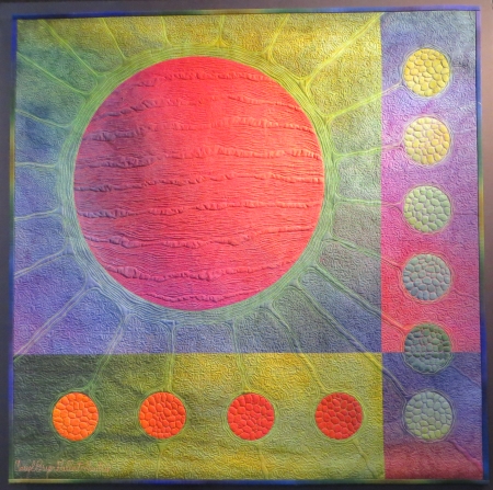
Caryl Bryer Fallert-Gentry (sweetie, it’s too many names…I get why you’re keeping all of them, I really do, but please…maybe just calling yourself Caryl would be good) has created a series of thirty 30-inch-square pieces that celebrate her thirty years of quiltmaking, referencing her past work, themes, etc., and using her fabric collections to complete them.

So. Here’s what I think. First of all, the more power to her. She has a strong body of work that is well-liked by many, the exhibit already has 8 venues it’s traveling to, and she definitely has the technical ability to be showcased like this. I liked being able to look closely at her insane stitching…
(Electric Ellipses #2)
Especially in the more cellular-looking pieces and the two beach sand pieces.

(Casting a Long Shadow #2)
That said…why redo ideas from the last 30 years? I don’t get it? I know it might be hard to put a retrospective together if a lot of your work has sold, and I do get what you’re saying about the exhibit being pulled together by all of them being the same size, but…eh. Make New Work. Put some old work in the show. I don’t understand. It was popular, though, so apparently I am in the minority. I want to see new work, though. You have a new life…how will that change your art?
Bodil Gardner had at least 4 pieces in Houston…with two in the SAQA: People and Portraits exhibit with mine. I’ve always liked her work…it’s quirky and graphic and slightly off, but Martha Sielman mentioned something in the People and Portraits Walk and Talk that I’d never really thought about…her work is inordinately cheery. There’s never a sad moment. It’s just nice and joyful and chaotic and happy (unlike my own work).

This is Santa Lucia and that is one BIG and happy spiral-eared dog. Maybe I need to channel some Bodil. Maybe she’d let me come stay with her for a while. One of the pieces in the People and Portraits exhibit had a large central female figure, like her pieces (and mine) often do, and there was a coffee cup balanced on her shoulder, like I often do. Sielman said that Gardner says it refers to how women often share a cup of coffee (or tea) together as part of their socializing, and that if she were doing men, she would probably do a beer stein instead.
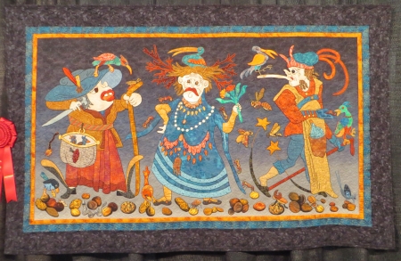
Another featured artist in People and Portraits is Sonia Bardella, whose faces have a particular quality to them.

This is Venice’s Carnival, which takes place near where she lives.
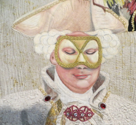
The best part is the detail she puts into the clothing in contrast to the skillfully painted faces.
Dianne Firth made four elements pieces for an exhibit, with Wind currently showing with the traveling Quilt National exhibit. This is Fire…
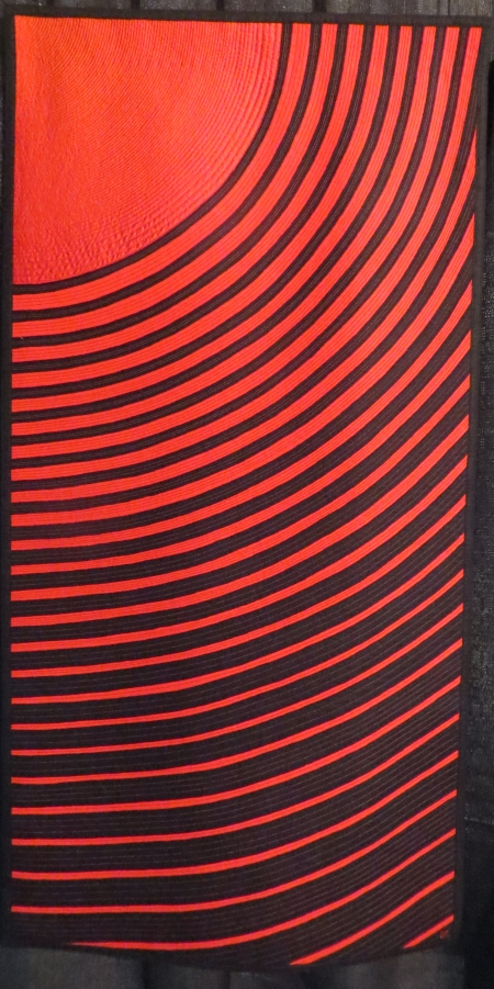
Which, like Wind, is much more stunning and vibrant in person…and was based on the volcanic eruptions in Iceland in 2010.
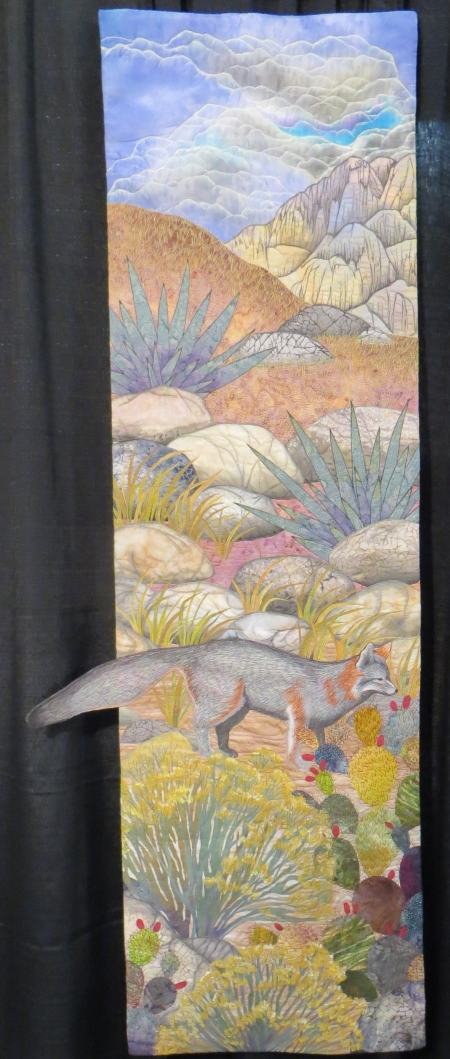
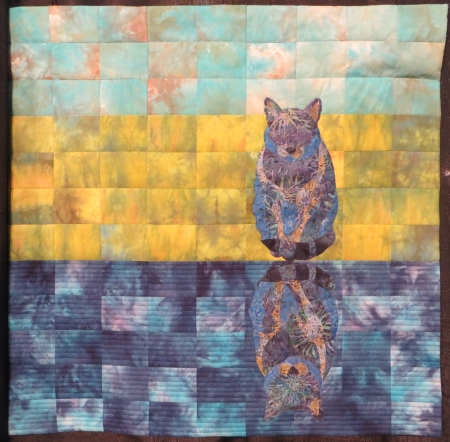
Betty Busby curated an exhibit of quilts called A Walk in the Wild, a SAQA exhibit of artists from New Mexico. Below is Busby’s piece, Desert Fox.
All the pieces were similar sizes…this is Where Earth and Sky Meet by Susan Szajer.

Her work deserved a detail shot…there are even tiny beads in there…

This one…Eight Ravens by Judith Roderick…was one of my favorite quilts in the show.

Her silk-painting technique adds a lot of interest and depth to her pieces, which have that graphic quality that I love, coming out of the printmaking world.

And the subject matter of the ravens is also a favorite. This piece glowed in person.
There were two dinosaur pieces by Shannon Conley that I liked…S Is for #4 is below…

Coelophysus bauri is the dino depicted in both quilts, apparently was thought to be a cannibal until recently. In the quilt above, Conley shows him in his Triassic-era habitat, with S Is for #3 below showing him in modern-day New Mexico.

Conley is a scientist who put real teeth on that first quilt…hopefully not valuable fossils (naw, they’re polymer clay). Here’s a link to her posts about these quilts.
Kathy York is one of my favorite brightly colored artists…you’ll notice I photographed lots of bright-colored quilts (a dream? hope? wish?). I posted York’s video of populating this quilt, Park Place, a while ago…

You can see it here on her blog post where she writes about making this quilt…

This is Stella in Yellow by Joanell Connolly.
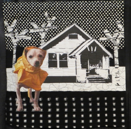
Stella is the dog in the raincoat, rescued from the animal shelter. I love the contrast and the pattern, with the pitiful-looking dog off to the side.
Both Stella and this one were part of a pet exhibit, It’s Raining Cats and Dogs, bringing awareness to saving animal lives. This is One Cat, Two Cat by Laura Bisagna.
Bisagna had been feeding a stray gray cat, and every day it would come out and eat, then go behind the house, and seemingly come out and eat again…until she realized there were two gray cats.
This piece was deceptively simple-looking until you studied it up close. This is Winter by Laurie Weiner.
The piece is whole-cloth, hand-dyed, and trapunto, but the quilting is what drew me to it…

Intense pattern and texture makes up this piece. I saw a lot of this close, patterned quilting and I’m always attracted to it, which is amusing, because I so don’t quilt like that…but it’s true that type of quilting would not lend itself to the images I create…so I am happy to admire it in other people’s work (and call them insane behind their backs…while they say the same about me and my 2000-piece quilts).
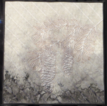
The sky drew me to this piece…In the Bleak Midwinter by Ruth Powers.

Being a Southern Californian, we rarely see winter landscapes such as these.
I always like to show Tanya Brown what pieces hers are hanging with…so there’s Under the Gingko Tree…

featuring her painted whole-cloth work and crazy tiny stitching…

As well as her boy actually standing still…a minor miracle in itself.
This one drew me to it with all the crazy detail…It’s a Crazy Life by Gail Thomas.

Gail’s own beautiful, long white hair was used to quilt this piece as she recovered from health issues…
Her painting on the fabric is very colorful and detailed.

This piece drew my eye because of parts of it…overall, I wasn’t sure I liked it, but I liked the faces. This is You Are Here by Victoria Findlay Wolfe…

The people are from digital photos manipulated in Photoshop and printed on fabric.

It’s an interesting use of a traditional pattern with modern tones to it…I’m not sure I like the whole thing (the silver lamé really bugs me), but I liked those parts.
This quilt had lots of funky details in it…and I kinda like how it’s just all globbed together…
And the use of pattern in the fabrics is really interesting too…
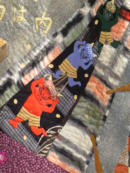
This is Japanese Calendar by Fumi Kido. The Japanese do often have a certain feel to their quilts…
I’m not sure what that’s about…because they often use American patterns, and it STILL feels Japanese to me. This one has a different appeal to me, though…very stylized but with those details.
I do hail from an applique background…and this one was beautifully done. This is Four Loons and Friends by Patricia Sellinger.

The symmetry and design in this quilt are stunning…and she embellished the birds with beads as well.

This is an original design.
I liked this one because of the flame-like blobs wandering across the design. This is May Your Burdens Be Light by Kazuko Covington. This is an original design using New York Beauty blocks, made after the tsunami that destroyed her hometown.

Those blobs now look like tsunami waves…
This one won best of show…Chihuly’s Gondola by Melissa Sobotka. That’s $10,000, people. It’s a beautiful quilt, but it is from a photograph of Chihuly’s installation in Texas from a few years back.

So tell me this…is there a difference in the art applied between Sobotka’s copy of another artist’s work (is this a Sobotka or a Chihuly?) and the Jane Sassaman (original design) below? I think yes…but I wasn’t a juror in this show (and probably never will be invited to be one either). I think Chihuly deserves a healthy percentage of the prize.
This is Jane Sassaman’s Illinois Album, also an award winner, but in my eyes, a much more deserving one.
You decide.
Another Bodil Gardner happy piece, this is I Arise from Dreams…

Sheila Frampton-Cooper had two of her graphic, colorful pieces in the show…this is Lair of the Amethyst Deva…

I see legs…Sheila’s another tight, detailed quilter, which suits her big, bold, abstract work.
Nearby was another somewhat controversial piece…yes, it’s abstract; yes, it’s colorful, even pretty…Roses in the Window by Carol Morrissey. On the surface, an original design from a photograph she took…but how did she get all those circles? Is it the same place my mom gets her circles? Where is her hand in this quilt?
Does what equipment we use to create a piece make it more art or less art? You’ll notice I have no pictures of quilts with digitized photos where the artist has printed it out full size and just stitched over it. I need to see the artist’s hand in the work…I need to see what they’ve changed or made their own. Feel free to BE a photographer (there was a great photography show at IQF), but if you’re going to put it on fabric, make sure there is a purpose to that. Why fabric? Why not just print a photograph on paper and frame it and be done with it? It’s something to think about…
Another Kathy York…this is You Are What You Eat…

Speaking of having your hand in your artwork, York made the batik flowers herself.
This piece…I still need this one explained. The graphic nature explains why I like it, but there is some weird stuff going on in this quilt. This is Alice’s Kitchen (obviously Alice in Wonderland) by Miki Murakami…I love that this is so NOT typically Japanese.

All she says is that this is how she imagined a kitchen in Alice’s story, even though there wasn’t one. I think I want to talk to this woman.
Sue Bleiweiss makes wonderfully graphic and deceptively simple pieces. This is Tutti Frutti City.

This one intrigued me…it was just plain weird, yet cool. This is The Birders by Suzanne Marshall, an original design inspired by a 1565 manuscript…ahhh…there’s why it’s weird.
I’ve taken pictures of her work before…liking the weird medieval qualities to her work…

Just look at that unhappy face.
This one caught my eye because I couldn’t (at first) figure out what it was…I thought maybe it was leaky tubes of paint. Silly me…it’s just Oregon Buoys by Jane Haworth.

I like my idea better…but I guess it caught my eye. Chaos and color.
Another Frampton-Cooper piece, this is Venus in the Garden, named by her sister, who saw Venus Flytraps (I see an angry parrot…that wouldn’t be a nice name though).

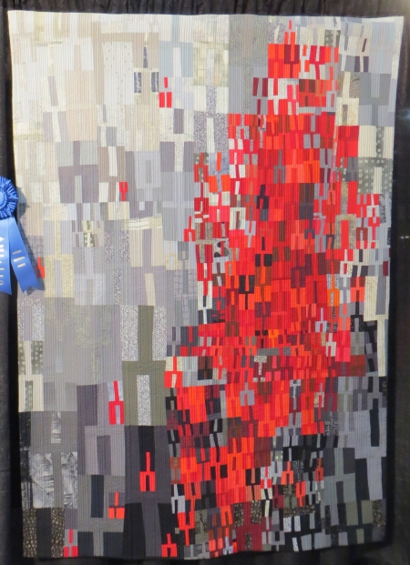
This one had a stunning use of color…this is Antelope Canyon by Kimberly Lacy.

And another winner, Tuning Fork #11 by Heather Pregger.
It’s a very graphic piece…she does lots of pieces like this, though. I wonder about that. I guess it’s a different challenge to work abstractly with the same shapes than to do what I do. (It would drive me bonkers though!)
OK, so there were all these cow quilts…something to do with a book. I liked this one because?

Come on. Guess. OK. It’s a cow skelly. How can you not love a cow skelly? Actually, I was walking past this part of the exhibit when someone pointed to the earrings on the cow and said, “Honestly, some of these quilts you cannot use as a QUILT!” Oh my. No ma’am, you can’t (she wasn’t old…younger by far than I am). So. There you have it. It’s a MooSkellyNotQuilt. Actually, it’s Dia de los MOOertos by Patricia Ward.
This one…it’s cute. It’s tiny. It’s beautifully made. It’s a prize winner. This is Masanobu Miyama’s Wind, a picture of the artist’s dog.

The statement talks about an original microfused applique technique. I do not know what this is, although micro means small and those pieces are freakin’ small (I should know).
This one caught my eye because of the fabrics…in the US, we are so into our cotton and occasionally a silk or two…this piece, The Berlin Bear by Marjan van der Heijden, was made completely with leftovers…

That were stitched together sort of haphazardly, but in a beautiful way…

Truly amazing use of fabric.
This Japanese landscape is so Japanese because of the taupe, but the imagery is so American…I wonder what the Japanese countryside actually looks like and why this appeals to them. This piece is A Place to Long For, by Aiko Yokoyama.

The fabric and design is beautiful…I just wonder why it’s so appealing.
So that’s my take on IQF 2013…there were probably quilts I didn’t photograph just because I was tired or in a mood (I was in a mood a lot), so don’t take it badly if yours isn’t here…mine is just one set of slightly jaded, tired, and miserable eyes among 60,000 viewers. I do know that I will miss IQF coming to Long Beach, California, because it was cheap and easy to get to, and I don’t think I’ll be going to Houston again for a good, long while, but I did enjoy some of the quilts quite a bit. I’ll talk more about the experience in general at another time. I do provide artist’s links when I can easily find them and confirm that they belong to the artist. If your work is here and you have a link you’d like me to use, please let me know.

I enjoyed reading your take on the Houston show.
LikeLike
Thanks for the photos post, and for the shot of my thing. Excellent comments. Wish there was a way to take in IQF in small bites, sort of like swilling one’s mouth out between courses. Maybe it pays to have a zen-like attitude and focus on the general experience rather than each of the details.
LikeLike
Thanks for a great recap of the show and for spotlighting one of my quilts!
LikeLike
Thanks for the window into IQF; your photos and comments were great.
About the 30 year retrospective and revisiting one’s old styles–I can see where you’re saying, “Make New Work” but I can also see that we are who we’ve been. Our experiences make us who we are. Returning to an old style, an old season, could be like rereading a favorite old book (I do that a lot). Maybe reclaiming and remembering who we used to be when we were making that art years ago, integrating and synthesizing the past with the present.
LikeLike
I’d hardly consider this post a product of your “lame-ass reporting style”, but I did laugh out loud when read that.
Great post and great comments, as usual. 🙂
We had a great time hanging out with you! -s
LikeLike
Thanks for the pics. I will probably never get to Houston, so I enjoy seeing everyone’s photos.
As far as the photographs and painting/copying prints onto fabric then calling it a quilt — I agree with you. If they want to be painters, then go be painters. Or photographers. I don’t like that a machine quilted copied picture is taking away from the handwork that quilting is about. Seems the last few years these are the quilts that win the grand prize when handwork quilts (Sassaman and others) are given lesser prizes.
LikeLike
My first thought when I saw the “Best in Show” winner was very similar to yours. Agree Jane’s (Sassaman) work deserved a bigger prize!
LikeLike